Category Archives: Research

Working with College Scorecard data

This post provides Stata commands to create a panel dataset out of the College Scorecard data. The first steps take only a few minutes, then the final destring step takes quite a while to run (at least an hour).

Step 1: Download the .csv files from here

In this example, I download these files into a “Scorecard” folder located on my desktop.

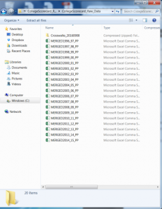
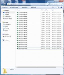
Notice how the file names have underscores in them. The first file is titled “MERGED1996_97_PP” and so on. Let’s drop the underscore and number in between (“_97_”) so the file now is titled “MERGED1996PP” and do this for each file:

Step 2: Convert .csv files to .dta files

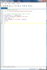
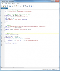
Our raw data is now downloaded and prepped. Open a Stata .do file and import these .csv files. The following loop is a nice way to do this efficiently:

  • Row 2 tells Stata where to find the raw .csv data.
  • Row 5 tells Stata to remember (as “i”) any number that fall between 1996 and 2014.
  • Row 6 tells Stata to import any .csv file in my directory named “MERGED`i’PP” — here the `i’ is replaced by the numbers 1996 through 2014. This is why we got rid of the underscores in Step 1, it helps this loop operate efficiently.
  • Row 7 generates a new variable called “year” and sets its value equal to the corresponding year in the file.
  • Row 8 saves each .csv file as a .dta file and keeps the same file naming convention as before.
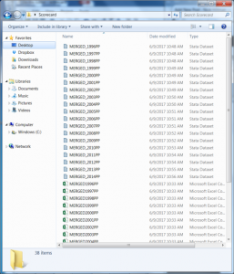
  • Row 9 tells Stata to start anew after each year so we end up with the following files in our directory:

Notice the .dta files are all now here and named in the exact same way as the original .csv files (well, technically I added an underscore after “MERGED”). This loop takes a few minutes to run.

Step 3: Append each year into a single file

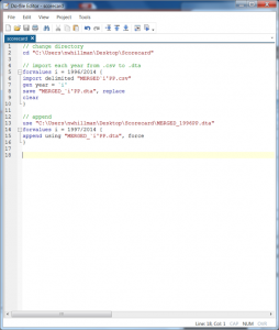
Now that we have individual files, we want to stack them all on top of each other. We have to start somewhere, so let’s open the 1996 .dta file and then append all future years, 1997 through 2014, onto this file:

We will do this in a small loop this time, where:

  • Row 13 tells Stata to open the 1996 .dta file
  • Row 14 tells Stata to remember as “i” the numbers 1997 to 2014
  • Row 15 tells Stata to append onto the 1996 file each .dta that corresponds with the year `i’. The “force” command is needed here only because some years a variable is coded as a string and others numeric, so this just tells Stata to bypass that quirk.

Step 4: Destring the data

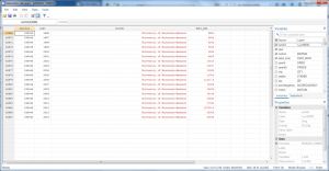
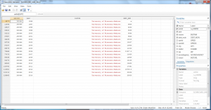
The data is now in a panel format, where each row contains a unique institution and year. Let’s take a quick look at UW-Madison (unitid=240444) by using the following command:

br ïunitid year instnm  debt_mdn if ïunitid==240444

We’re almost done, but notice a couple of quirks here. First, the median debt value is red, meaning it is string (because 1996 is “NULL”). Second, the variable ïunitid should be renamed to just plain old “unitid” – otherwise, things look pretty good here in terms of setting up a panel.

The following loop will clean this all up for us. It took me at least an hour, be warned. (Thank you Nick Cox for your helpful de-bugging!)

  • Row 19 renames ïunitid to unitid
  • Row 20 tells Stata to find string variables
  • Row 21 tells Stata to remember as “x” all variables in the file
  • Rows 22 and 23 replace all those NULLs and PrivacySuppressed cells with “.n” and “.p” missing values, respectively.
  • Row 25 destrings and replaces all variables

So now when we look at UW-Madison, we see the median debt values are black, meaning they are destringed (destrung?) with the “NULL” value for 1996 missing.

Step 5: Add variable and value labels

Thanks to Kevin Fosnacht (Indiana University), you can also add labels with the commands found below in the .do file. Thanks, Kevin!

Step 6: Save the new file so you don’t have to run all this again.

You now have all Scorecard data from 1996 to 2014 in a single panel dataset, allowing you to merge with other data sources and analyze this with panel data techniques.

There are several other ways one could go about managing this dataset and creating the panel, so forgive me for any omissions or oversights here. My goal is to simply help remove a data access barrier to facilitate greater research use of this public resource. Grad students developing their research programs might find this a useful data source for contributing to and extending higher education policy scholarship.

.do file: scorecard

Update 6/12/2017: the “.n” and “.p” command had a small bug on the destring loop. But thanks to Nick Cox, this is now fixed! Also, Kevin Fosnacht was so kind as to share his relabeling code, many thanks!

October to June high school FAFSA filing

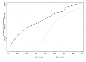
We are 36 weeks into the 2017-18 FAFSA cycle and 2.04 million high school seniors have completed the form as of June 2, 2017. This is an increase of about 200,000 over last cycle, or about a 10% overall increase:

In this chart, a few important spikes stand out. The first is the holiday bumps we see in November and December, where filing slows down in a couple of weeks and the rebounds after the new year. The second is the March bump, as several states (notably, CA) have filing deadlines. The third is an early April bump that is simply an artifact of the way the Office of Federal Student aid began defining a high school senior. Up to that week, seniors included students no older than 18. Now it includes students no older than 19. This is a good change in the long-run, but ideally we would have 18-year-olds reported for the entire cycle.

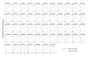
With these details in mind, below is a chart showing the same trend but for each individual state (to June 2, 2017):

To put this another way, here’s a map showing the percent change in the two cycles, where Utah grew the most (39% increase) and Rhode Island the least (6% decrease).


Raw data (.xlsx): State Weeks – Oct to June 2


Testimony to Assembly Committee on Colleges and Universities

On April 13, 2017, the Wisconsin Assembly Committee on College and Universities held an informational hearing on outcomes-based funding for higher education. The video of the entire hearing is available here. Below are the notes from my testimony, including appendices with additional information.

1. Preliminaries

When approaching PBF/OBF, I think first about the underlying problem to be solved and how PBF gives policymakers the levers to solve them. This approach will hopefully help us avoid predictable pitfalls and maximize the odds of making a lasting and positive difference in educational outcomes.

  • What is the underlying problem to be solved/goal to be achieved?

    • Some possibilities:
      • Increase number degrees awarded (see Appendix A)
      • Tighten connection between high school and college
      • Close inequalities in graduation rates
      • Improve affordability and debt burdens
      • Improve transparency and accountability for colleges
      • All of the above, plus more?
  • What policy levers does PBF/OBF offer for solving these problems?
    • Financial incentives: 2% of UWS annual budget; millions for campuses
    • Persuasive communication: transparency and focusing of goals
    • Capacity building: technical and human resources to perform
    • Routines of learning: system-wide network of best practices, data sharing
  • What can we learn from outside higher education?
    • Pay-for-performance should work when:
      • Goals are clearly measured
      • Tasks are routine and straightforward
      • Organizations are specialized, non-complex
      • Employees are not motivated
      • Outcomes are immediately produced
    • But efforts rarely produce large or sustained effects:
      • K-12
      • Job training
      • Crime & policing
      • Public health
      • Child support
    • We are left with a conundrum where the policy is spreading but without convincing or robust evidence that it has improved outcomes: PBF/OBF states have not yet out-performed others.
      • Political success versus programmatic success.

2. Overview of higher education PBF/OBF research
Disentangling the effect of the policy from other noise is challenging, but possible. I have produced some of this research and am the first to say it’s the collection of work – not a single study – that can explain what is happening. Here is a quick overview of the academic evaluations that adhere to social science standards, passed peer review, and are published in the field’s top research journals.

  • What are the biggest challenges to doing research in this area?
    • Treatment vs. dosage
    • New vs. old models
    • Secular trend vs. policy impact
    • Lags and implementation time
    • Intended vs. unintended outcomes
  • What has the research found?
    • Older studies
      • Documenting which states and when (1990-2010)
      • Focus on AAs and BAs
      • No average effects
        • Small (0.01 SD) lagged effect for BA degrees (PA)
        • Small (0.04 SD) lagged effects for AA (WA)
      • Newer studies
        • Institution-level and state case studies
        • Focus on retention, certificates, AAs, BAs, and resource allocation
        • Account for implementation lags and outcome lags
        • Differentiates old from new models
        • No average effects
          • No effect on graduation rates
          • No effect on BA even with lags (PASSHE, OH, TN, IN)
          • No effect on retention or AA (WA, OH, TN)
          • Modest change in internal budget, research vs instruction
        • Negative effects
          • Sharp increase in short-term certificates (WA, TN)
          • Reduced access for Pell and minority students (IN)
          • Less Pell Grant revenue

3. Pros and cons

  • Despite these findings, there is still an appetite for adopting and expanding PBF/OBF in the states and for good reason:
    • Focus campus attention on system-wide goals
    • Increases public transparency
    • Helps stimulate campus reform efforts
      • Remedial education reform
      • Course articulation agreements
      • More academic advisors, tutors, etc.
  • But pursuing this course of action has significant costs that should be considered and avoided to the fullest extent possible:
    • Transaction costs: new administrative burdens for campuses
    • Goal displacement: trades research for teaching, weaker standards
    • Strategic responses: gaming when tasks are complex and stakes are high
    • Democratic responsiveness: formula, not legislators, drive the budget
    • Negativity bias: focus on failures over successes, can distract attention

4. Recommendations

If I were asked to design a PBF/OBF system for the state, I would adhere to the following principles. These are guided by the most recent and rigorous research findings in performance management and higher education finance:

  • Use all policy instruments available to maximize chances of success.
    • Financial capacity (e.g., instructional expenses and faculty-student ratio) is the strongest predictor of time-to-degree, so reinvestment will likely yield greatest results regardless of funding model
    • Analytical capacity and data infrastructure needs to be built, used, and sustained over time to make the most of the performance data generated by the new model
    • Invest in system’s capacity to collect, verify, and disseminate data (see Missouri’s Attorney General’s recent audit)
    • Build campus’ technical and human resource capacity before asking campuses to reach specific goals (Appendix B has promising practices).
  • Avoid one-size-fits-all approaches by differentiating by mission, campus, and student body.
    • Different metrics per campus
    • Different weights per metric
    • Input-adjusted metrics
    • Hold-harmless provisions to navigate volatility
  • Use prospective, rather than retrospective, metrics to gauge progress and performance on various outcomes.
    • Consider developing an “innovation fund” where campuses submit requests for seed funding allowing them to scale up or develop promising programs/practices they currently do not have capacity to implement.
    • Use growth measures rather than peer-comparisons, system averages, or rankings when distributing funds.
    • Monitor and adjust to avoid negative outcomes and unintended results.
  • Engage campuses and other stakeholders in developing and designing performance indicators. Without this, it is unlikely for PBF/OBF to be visible at the ground-level and to be sustained over political administrations.
    • Create a steering committee to solicit feedback, offer guidance, and assess progress toward meeting system PBF/OBF goals.
    • See Appendix C for questions this group could help answer.

Appendix A:
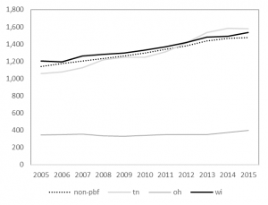
On average, PBF/OBF states have not yet outperformed non-PBF/OBF states in terms of degree completions. To the extent they have, the effects are isolated in short-term certificate programs, which do not appear to lead to associate’s degrees and that (on average) do not yield greater labor market returns than high school diplomas.

Figure 1:
Average number of short-term certificates produced by community/technical colleges
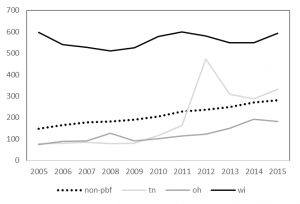
Figure 2:
Average number of long-term certificates produced by community/technical colleges
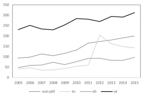
Figure 3:

Average number of associate’s degrees produced by community/technical colleges
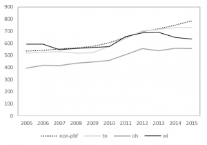
Figure 4:
Average number of bachelor’s degrees produced by public research universities
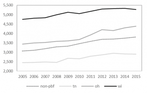
Figure 5:
Average number of bachelor’s degrees produced by public masters/bachelor’s universities
Appendix B:

While there are many proposed ideas to improve student outcomes in higher education, most are not evidence-based. This policy note identifies practices where there is a strong evidence base for what works, based on the high-quality, recent and rigorous research designs.

  • Investment in instructional expenditures positively impacts graduation rates.[i] Reducing instructional resources leads to larger class sizes and higher faculty-to-student ratios, which is a leading reason why students take longer to earn their degrees today.[ii] When colleges invest more in instruction, their students also experience more favorable employment outcomes.[iii] There may be cost-saving rationales to move instruction to online platforms, but this does not improve student outcomes and often results in poorer academic performance primarily concentrated among underrepresented groups.[iv]
  • Outside the classroom, student support services like advising, counseling, and mentoring are necessary to help students succeed.[v] Recent studies have found retention and graduation rates increase by both intensive and simpler interventions that help students stay on track.[vi] Interventions that help students navigate the college application and financial aid process have a particularly strong evidence base of success.[vii]
  • Need-based financial aid increases graduation rates by approximately 5 percentage points for each $1,000 awarded.[viii] When students receive aid, they attempt and complete more credit hours, work fewer hours, and have even more incentives to persist through graduation.[ix] Coupling financial aid with additional student support services (e.g., individualized advising) yields even stronger outcomes, [x] particularly among traditionally underrepresented students.[xi] When tuition rises without additional aid, students are less likely to enroll and persist and these effects again disproportionately affect underrepresented students.[xii]
  • Remedial coursework slows students’ progress toward their degree, but does not necessarily prevent them from graduating. Remedial completers often perform similar to their peers and these leveling effects are strongest for the poorest-prepared students.[xiii] High school transcripts do a better job than placement exams in predicting remediation success,[xiv] and some positive effects may come via changing instructional practices and delivering corequisite remedial coursework.[xv] But even without reforming remediation, enhanced academic and financial support services have been found to greatly improve remedial completion and ultimately graduation rates.[xvi]
  • Place-based College Promise programs guarantee college admission and tuition waivers for local high school students. There are more than 80 programs operating nationwide with several across Wisconsin: Gateway College Promise, LaCrosse Promise, Milwaukee Area Technical College Promise, Milwaukee’s Degree Project, and Madison Promise.[xvii] Program evaluations in Kalamazoo, MI, and Knoxville, TN, find the programs have positive effects on college access, choice, and progress toward degree completion.[xviii]

Appendix C:
Below are additional questions to consider as legislators, regents, and system officials move forward in their planning efforts.

  • What is the purpose of PBF and who are the most likely users of the data? Is it external accountability – implying the legislature or public will be the primary users? Or campus-driven improvement – implying campus administration will be the primary users?
  • How is the data collected, verified, and reported? By whom and with what guidelines?
  • How well does a metric measure what it sets out to measure? Are there key aspects of higher education that are not being measured?
  • What technical and human resource capacity do campuses have to use this data? How?
  • What unintended result might occur by prioritizing a particular metric over another?
  • How might the numbers be gamed without improving performance or outcomes?
  • Who on campus will translate the system’s performance goals into practice? How?
  • When numbers look bad, how might officials respond (negativity bias)?

Endnotes

[i] Webber, D. A. (2012). Expenditures and postsecondary graduation: An investigation using individual-level data from the state of Ohio. Economics of Education Review, 31(5), 615–618.

[ii] Bound, J., Lovenheim, M. F., & Turner, S. (2012). Increasing time to baccalaureate degree in the United States. Education, 7(4), 375–424. Bettinger, E. P., & Long, B. T. (2016). Mass Instruction or Higher Learning? The Impact of College Class Size on Student Retention and Graduation. Education Finance and Policy.

[iii] Griffith, A. L., & Rask, K. N. (2016). The effect of institutional expenditures on employment outcomes and earnings. Economic Inquiry, 54(4), 1931–1945.

[iv] Bowen, W., Chingos, M., Lack, K., & Nygren, T. I. (2014). Interactive Learning Online at Public Universities: Evidence from a Six‐Campus Randomized Trial. Journal of Policy Analysis and Management, 33(1), 94–111.

[v] Castleman, B., & Goodman, J. (2016). Intensive College Counseling and the Enrollment and Persistence of Low Income Students. Education Finance and Policy.

[vi] Bettinger, E. P., & Baker, R. B. (2014). The Effects of Student Coaching An Evaluation of a Randomized Experiment in Student Advising. Educational Evaluation and Policy Analysis, 36(1), 3–19.

[vii] Bettinger, E. P., Long, B. T., Oreopoulos, P., & Sanbonmatsu, L. (2012). The Role of application assistance and information in college decisions: results from the H&R Block FAFSA experiment. The Quarterly Journal of Economics, 127(3), 1205–1242.

[viii] Castleman, B. L., & Long, B. T. (2016). Looking beyond Enrollment: The Causal Effect of Need-Based Grants on College Access, Persistence, and Graduation. Journal of Labor Economics, 34(4), 1023–1073. Scott-Clayton, J. (2011). On money and motivation: a quasi-experimental analysis of financial incentives for college achievement. Journal of Human Resources, 46(3), 614–646.

[ix] Mayer, A., Patel, R., Rudd, T., & Ratledge, A. (2015). Designing scholarships to improve college success: Final report on the Performance-based scholarship demonstration. Washington, DC: MDRC. Retrieved from http://www.mdrc.org/sites/default/files/designing_scholarships_FR.pdf Broton, K. M., Goldrick-Rab, S., & Benson, J. (2016). Working for College: The Causal Impacts of Financial Grants on Undergraduate Employment. Educational Evaluation and Policy Analysis, 38(3), 477–494.

[x] Page, L. C., Castleman, B., & Sahadewo, G. A. (Feb. 1, 2016). More than Dollars for Scholars: The Impact of the Dell Scholars Program on College Access, Persistence and Degree Attainment. Persistence and Degree Attainment.

[xi] Angrist, J., Autor, D., Hudson, S., & Pallais, A. (2015). Leveling Up: Early Results from a Randomized Evaluation of Post-Secondary Aid. Retrieved from http://economics.mit.edu/files/11662

[xii] Hemelt, S., & Marcotte, D. (2016). The Changing Landscape of Tuition and Enrollment in American Public Higher Education. The Russell Sage Foundation Journal of the Social Sciences, 2(1), 42–68.

[xiii] Bettinger, E. P., Boatman, A., & Long, B. T. (2013). Student supports: Developmental education and other academic programs. The Future of Children, 23(1), 93–115. Chen, X. (2016, September 6). Remedial Coursetaking at U.S. Public 2- and 4-Year Institutions: Scope, Experiences, and Outcomes. Retrieved from https://nces.ed.gov/pubsearch/pubsinfo.asp?pubid=2016405

[xiv] Scott-Clayton, J., Crosta, P. M., & Belfield, C. R. (2014). Improving the Targeting of Treatment: Evidence From College Remediation. Educational Evaluation and Policy Analysis, 36(3), 371–393. Ngo, F., & Melguizo, T. (2016). How Can Placement Policy Improve Math Remediation Outcomes? Evidence From Experimentation in Community Colleges. Educational Evaluation and Policy Analysis, 38(1), 171–196.

[xv] Logue, A. W., Watanabe-Rose, M., & Douglas, D. (2016). Should Students Assessed as Needing Remedial Mathematics Take College-Level Quantitative Courses Instead? Educational Evaluation and Policy Analysis, 38(3), 578–598.  Wang, X., Sun, N., & Wickersham, K. (2016). Turning math remediation into “homeroom”: Contextualization as a motivational environment for remedial math students at community colleges.

[xvi] Scrivener, S., Weiss, M. J., Ratledge, A., Rudd, T., Sommo, C., & Fresques, H. (2015). Doubling Graduation Rates: Three-Year Effects of CUNY’s Accelerated Study in Associate Programs (ASAP) for Developmental Education Students. Washington, DC: MDRC. Butcher, K. F., & Visher, M. G. (2013). The Impact of a Classroom-Based Guidance Program on Student Performance in Community College Math Classes. Educational Evaluation and Policy Analysis, 35(3), 298–323.

[xvii] Upjohn Institute. (2016). Local Place-Based Scholarship Programs. Upjohn Institute. Retrieved from http://www.upjohn.org/sites/default/files/promise/Lumina/Promisescholarshipprograms.pdf

[xviii] Carruthers, C.  & Fox, W. (2016). Aid for all: College coaching, financial aid, and post-secondary persistence in Tennessee. Economics of Education Review, 51, 97–112. Andrews, R., DesJardins, S., & Ranchhod, V. (2010). The effects of the Kalamazoo Promise on college choice. Economics of Education Review, 29(5), 722–737.
Migration of WI high school graduates

Last week, two state lawmakers proposed a new merit-based financial aid program designed to help keep the “best and brightest” Wisconsin students in-state for college. This got me intrigued about the extent of out-of-state migration occurring among recent WI high school graduates: how many students go out of state in the first place?  And where do they go?
To answer the second question first, below is a map showing where recent Wisconsin high school graduates began college:

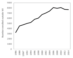
In answering the first question, here are the out-migration patterns of recent Wisconsin high school graduates since 1986 (Figure 1). During the 1980s and 1990s, the number of WI residents attending college out-of-state steadily rose. After its peak in the early 2000s, the number has steadily fallen over the past decade. In 2014, approximately 7,600 WI high school graduates went out of state for college.

Figure 1:
Number of WI recent high school graduates enrolling outside Wisconsin

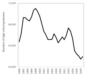
The steady drop in out-of-state enrollment coincides with the statewide trend of fewer high school graduates (Figure 2). With fewer students graduating from high school, there are fewer attending out-of-state and we should not expect this trend to reverse any time soon. This chart uses WICHE projections of high school graduates in the state, which is expected to plateau and then decline over the next decade.

Figure 2:
Total number of high school graduates in Wisconsin

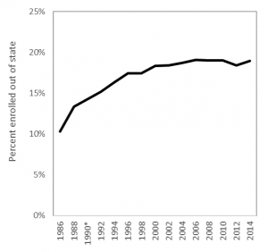
With fewer graduates – and fewer leaving Wisconsin – it is the proportion of students leaving that gives a clearer view of out-migration. Figure 3 shows the percentage of recent high school graduates from Wisconsin who enroll in other states. After steady growth in the 1980s, this trend stabilizes in the mid-1990s and has hovered around 17 to 19 percent since then.

Figure 3:
Percentage of recent high school graduates attending out of state

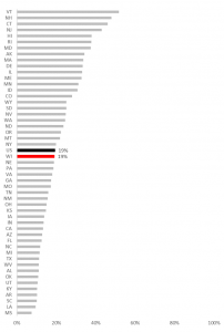
With about 1 in 5 recent high school graduates leaving the state, this puts Wisconsin right at the national average in terms of out-migration. Figure 4 uses Digest of Education Statistics data to show how Wisconsin fares compared to other states. On one extreme is Vermont, where more than half of their recent high school graduates attend out of state. On the other extreme is Mississippi, where fewer than 1 in 10 leave for college. Wisconsin’s out-migration rate is higher than Michigan and Iowa, but far lower than Illinois and Minnesota.

Figure 4:
Percent of recent high school graduates enrolling out-of-state

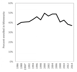
Since Wisconsin and Minnesota have a tuition reciprocity agreement, the next figure shows the share of Wisconsin out-migrants who attended a college in Minnesota. Not all of out-migrants participate in a tuition reciprocity agreement, so this chart should not be interpreted in that light; rather, this simply shows the proportion of Wisconsin residents who attended any Minnesota institution. In the early 2000s, the majority of Wisconsin leavers went to Minnesota, but this is no longer the case.

Figure 5:
Share of Wisconsin high school graduates enrolled in Minnesota colleges

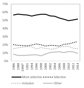
When Wisconsin high schoolers go out of state for college, they often attend “more selective” four-year universities. For reference, three UW System universities are classified in this category: Madison, Eau Claire, and La Crosse. However, Figure 6 uses the Carnegie Classification to show this is not always the case, as many leavers attend less selective institutions. This trend requires greater attention, but may indicate that students leave the state for other reasons than attending highly-selective universities.

Figure 6:
Percent of recent high school graduates who left Wisconsin, by selectivity band

The purpose of this post is to help contextualize and bring data to bear on recent discussions regarding student migration patterns. These back of the envelope estimates use IPEDS data that include only first-time degree-seeking students who graduated high school within the past 12-months and enrolled in college. It is possible other patterns emerge using different datasets, for Wisconsin residents who are not recent high school graduates, or for those who are not first-time students. Much more research is needed to track the extent of out-migration, but the sketches provided here aim to help explain the extent of out-migration among recent high school graduates and to identify where out-migrants enroll. Knowing this may help diagnose the severity of the “brain drain” problem while also helping campus leaders develop efficient and effective strategies for growing the stock of human capital in the state.

Data:

Total Stayed in Wisconsin Left Wisconsin
Subtotal Public 4yr Non-profit 4yr Subtotal Public 4yr Non-profit 4yr
1986 31,277 28,058 19,069 2,508 3,219 1,356 1,632
1988 33,774 29,268 18,753 3,265 4,506 2,006 2,229
1990* 33,269 28,525 17,037 3,529 4,744 2,071 2,365
1992 32,763 27,782 15,321 3,793 4,981 2,136 2,500
1994 31,771 26,585 15,638 3,367 5,186 2,367 2,438
1996 33,151 27,371 17,330 3,333 5,780 2,599 2,739
1998 34,621 28,592 18,802 3,662 6,029 2,788 2,836
2000 36,661 29,946 17,969 3,851 6,715 3,213 2,909
2002 38,148 31,135 19,046 3,733 7,013 3,526 2,682
2004 39,420 32,040 19,370 4,078 7,380 3,875 2,622
2006 42,270 34,212 21,029 4,528 8,058 3,851 3,173
2008 41,749 33,812 20,546 4,620 7,937 3,721 3,259
2010 42,424 34,366 20,820 4,682 8,058 3,661 3,352
2012 41,945 34,220 21,117 4,337 7,725 3,565 3,262
2014 40,489 32,812 20,502 4,271 7,677 3,598 3,340

* 1990 is estimated by taking the mean of the prior and following years; data are not reported this year.

High school FAFSA completions by April 21, 2017

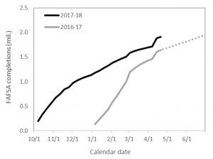
As of April 21, 2017, just over 1.9 million high school seniors completed the FAFSA. This is about 0.3 million more than at the same week last year, or a nice 15% bump. By the end of June last year, about 1.95 million students filed, so we’re on pace to surpass that number next month.

There is another bump worth keeping track of here. Beginning with the April 14 data release, the US Department of Education started counting 19 year old high school seniors. Prior to that week, all data represented 18 year olds.

On the upside, including 19 year olds now gives us a fuller picture of FAFSA filing. But on the downside, this affects our ability to consistently measure weekly changes for the full cycle. We’re hopeful the good folks at FSA will be able to run this data for 18 year olds and 19 years olds, separately, and we’ll provide updates accordingly.

This bump also occurred around the federal tax filing deadline, so it could also be driven in part by families filing the form when they did their taxes. We would be more likely to see that in last year’s cycle that didn’t have PPY, but we can’t disentangle all that here in our simple trend line. We’re just sharing our top-line trends in filing, see the raw data below:

Week Calendar 2016-17 2017-18
1 10/1
2 10/7 196,736
3 10/14 328,607
4 10/21 448,958
5 10/28 563,560
6 11/4 672,694
7 11/11 740,843
8 11/18 842,620
9 11/25 882,778
10 12/2 976,563
11 12/9 1,023,711
12 12/16 1,067,470
13 12/23 1,099,324
14 12/30 1,130,204
15 1/6 135,387 1,177,839
16 1/13 239,605 1,223,452
17 1/20 334,837 1,276,410
18 1/27 444,951 1,323,681
19 2/3 591,914 1,382,554
20 2/10 711,858 1,422,119
21 2/17 852,752 1,464,928
22 2/24 990,403 1,504,861
23 3/3 1,198,080 1,589,941
24 3/10 1,269,537 1,622,445
25 3/17 1,332,608 1,649,064
26 3/24 1,380,565 1,669,891
27 3/31 1,425,995 1,693,031
28 4/7 1,458,624 1,716,540
29 4/14 1,604,050 1,883,706
30 4/21 1,645,964 1,908,146

Community colleges and upward mobility

Below is a map identifying colleges operating in education deserts, or commuting zones where there are either: a) zero public colleges or b) a single community college is the only broad-access public option. This definition gives a useful but certainly not comprehensive view into communities around the country where prospective students’ choices are most constrained.

(Tableau page here)

But I do not believe that having fewer choices necessarily means students’ outcomes will be poor. It certainly may, but this is an empirical question that I don’t think has been closely examined. It turns out, I’m finding community colleges located in these deserts have higher than average mobility rates. And this is even after controlling for the local community zone mobility rate and a rich set of college-level covariates (including transfer-out graduation rates).

This is from my ongoing work for an upcoming conference at William & Mary on higher education and social mobility. For that conference, I’ll be presenting preliminary findings from what I’ve learned after merging IPEDS, Scorecard, and mobility report card data. I’m still sorting through it all, but it seems pretty consistent with Chetty et al’s findings that open-access colleges (especially when they’re the only public game in town) have high mobility rates.

I wanted to share this map to see if anybody notices anything strange. IPEDS and Scorecard don’t include satellite campuses and in some cases they merge campuses to central offices that may artificially result in a desert due to reporting issues. For example, Indiana’s Ivy Tech Community Colleges stopped reporting campus-level data in 2011 when they centralized their Program Participation Agreement, meaning it looks like the only Ivy Tech is in Indianapolis when we know they’re located all over the state. I’ve tried to adjust for some of the big problems like this one, but am still fine-tuning others (e.g., cleaning up some of the exclusively online colleges, etc.).

Feedback welcome!

March FAFSA deadlines – Part II

Each Friday, the US Department of Education publishes FAFSA filing data for all high schools in the country. We have been using this data to examine trends in filing, both for prior cycles and the the current (2017-18) cycle.

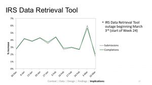
Last Friday, we presented at the AEFP conference or working paper (here) on filing rates and we thought it would be fun to throw in a slide on the new data that was released earlier that morning. We wanted to do that because it was the first look at filing since the IRS and Department of Education suspended the Data Retrieval Tool (DRT) on March 3rd. This tool made it easier for filers to import their tax records, which in turn should help students complete the form and reduce the need for verification.

In that presentation we shared the following slide, saying the dip corresponded with the DRT suspension.

In our discussion and in the following conversations, we pointed out that some states have March deadlines that could be behind the spike and drop we see here. Attendees at the session also noted that the drop could simply be a result of secular trends, rather than the tool being unavailable. This is what we loved so much about the conference — we could puzzle together on an ongoing policy issue and we could discuss appropriate research designs for disentangling secular trends from the “treatment” effect.

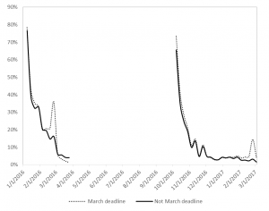
I am still in conference mode, so I was eager to follow up on this when I returned home. Here is a quick look at those secular trends comparing states with early March deadlines (CA, ID, IN, MD, MI, OR, WV) to all other states.

This chart is a little hard to read, but the left shows last year’s cycle and the right is this year’s. We’re looking at the week-to-week percentage point change in FAFSA completions among high school seniors.

The dotted line represents states with early March filing dates, and sure enough we see the early-March spike in both cycles. And, as expected, we don’t see that spike in other states.

But notice one thing: the weekly trends show much steeper changes than this year’s cycle. This is because last year was much more condensed and this year is spread out over three additional months.

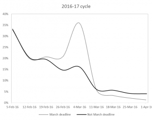
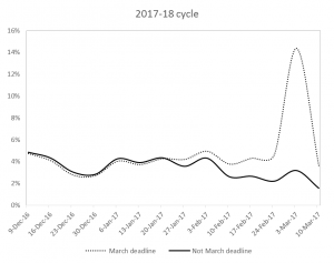
The March spike last year went from 21% to 36%, a 14 percentage point bump in a single week! This year, the bump is much smaller, but it is still large relative to other weeks: a 9 ppt bump.

I wanted to show these big picture trends just to get the complete cycle in our minds. But this is hard to see in the above chart, so let’s zoom in.

We see the steep weekly declines in the 2016-17 cycle, where “early March” states basically flat-line by the end of the month. And the other states slow down to about 5 percent growth rates through April.

In the 2017-18 cycle, we still see that spike and we can anticipate the “early March” states will flat-line in the coming weeks. But it looks like the weekly trend holds pretty steady from week to week, hovering around 4 percent until February when it dips down to 2 percent.

[Side note: Look at the holiday season dip here, where filing drops in December. It does the same around Thanksgiving in the other chart above.]

The DRT suspension occurred on March 3rd, which likely had little to no effect on “early March” states so long as their deadlines were on March 1 or 2. But in the other states, we see March 10 (the week following the DRT suspension) reach its lowest point all cycle. The growth rate drops to 1.6% and we will monitor whether it rebounds in the coming weeks.

Considering that 1.78 million high school filers completed by June 30 last year, we have a long way to go to beat that level. We are currently at 1.62 million completions. That’s 160,000 a student gap that needs to be filled in 15 weeks. We can get there with a weekly growth rate less than 1 percent. We are already far above where we were last year in terms of completions, and I doubt weekly growth rates will slow below 1 percent. But this needs monitoring to be sure we’re on pace.

Whether the dip we saw this week was just part of the secular trend or whether it was because of the DRT suspension, we cannot say for sure with this descriptive analysis. We just wanted to share the data and bring this into the conversation. We don’t want to add noise or confusion to that conversation and we want to point out that it is hard to disentangle secular trends from the “treatment” effect. And that’s precisely why AEFP is a good conference to visit in order to share preliminary findings and to work through questions together.

We’ll keep monitoring this and piecing together as best of a picture as we can. Feedback welcome, as always!

Data:

Early March states Not early March states
Completed Submitted Completed Submitted
2016-17 cycle
January 8, 2016 30,515 36,605 104,872 125,304
January 15, 2016 54,412 64,185 185,193 216,134
January 22, 2016 77,754 91,606 257,083 299,213
January 29, 2016 104,997 123,217 339,954 392,649
February 5, 2016 139,918 163,356 451,996 518,168
February 12, 2016 167,847 194,819 544,011 618,187
February 19, 2016 202,543 234,077 650,209 736,784
February 26, 2016 244,641 280,501 745,762 837,536
March 4, 2016 332,235 383,092 865,845 967,066
March 11, 2016 351,423 402,080 918,114 1,020,316
March 18, 2016 362,821 412,751 969,787 1,074,355
March 25, 2016 370,270 416,572 1,010,295 1,110,564
April 1, 2016 374,809 420,089 1,051,186 1,152,268
2017-18 cycle
October 7, 2016 36,760 41,943 159,976 180,256
October 14, 2016 63,726 71,756 264,881 293,808
October 21, 2016 89,957 101,377 359,001 396,507
October 28, 2016 115,443 129,415 448,117 492,713
November 4, 2016 139,479 155,856 533,215 584,646
November 11, 2016 154,773 172,794 586,070 641,763
November 18, 2016 177,266 197,186 665,354 726,252
November 25, 2016 186,013 206,853 696,765 759,629
December 2, 2016 207,066 229,919 769,497 837,037
December 9, 2016 216,850 240,117 806,861 875,767
December 16, 2016 225,690 249,402 841,780 912,144
December 23, 2016 231,912 255,948 867,412 939,113
December 30, 2016 238,191 262,747 892,013 965,228
January 6, 2017 247,790 273,030 930,049 1,006,055
January 13, 2017 256,997 282,662 966,455 1,045,077
January 20, 2017 267,939 294,030 1,008,471 1,090,663
January 27, 2017 279,177 305,858 1,044,504 1,127,559
February 3, 2017 292,968 320,433 1,089,586 1,175,960
February 10, 2017 303,994 332,054 1,118,125 1,204,642
February 17, 2017 317,077 346,011 1,147,851 1,235,870
February 24, 2017 331,670 361,602 1,173,191 1,262,285
March 3, 2017 379,359 419,348 1,210,582 1,302,398
March 10, 2017 392,864 430,926 1,229,581 1,320,855


March FAFSA deadlines

A handful of state financial aid programs have early-March FAFSA filing deadlines, including some popular ones like California’s Cal Grant and West Virginia’s PROMISE scholarship.

Still other states (like Indiana and Texas) have mid-March deadlines that are now being pushed back to April due to the Data Retrieval Tool suspension.

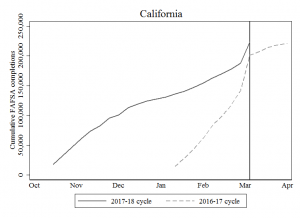
Now that we have high school FAFSA filing data up to March 3rd from the Office of Federal Student Aid, we can see how filing spikes in the week(s) leading up to the deadline.

In California, about 201,000 high school seniors filed before the March 2nd deadline last year. But this year, that number is up about 10% and just shy of 224,000:

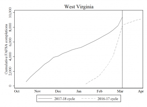
We see a similar spike in West Virginia, where FAFSA completions jump in the week or two prior to the deadline. Last year, about 8,300 high school seniors applied by the deadline and this year that number rose to almost 9,500 (a 13% jump).

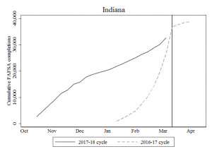
Indiana’s original deadline was March 15th, and we can anticipate a similar jump prior to the deadline. Last year, they had about 27,000 completions going into March and this spiked up to 37,500 after the deadline, which is about a 40% spike in volume over the course of two weeks. But with the DRT suspension, there’s a good chance this jump is stunted, we will see tomorrow. And kudos to Indiana for extending the deadline to April 15!

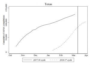
I am not quite sure how to make sense of Texas (said every non-Texan ever). But right from the start of the new filing cycle, Texas high school seniors completed a large number of FAFSAs during the fall. Even though their state’s deadline is March 15, more students filed by February this year than the total number of filers by April of last year. Way to go, Texas! Maybe Texas is just different, but it makes me think deadlines may not always be associated with spikes. I’m sure there’s a lot of nuance I’m missing here, but this one really intrigues me compared to the prior few states.

We’ll continue to monitor the post-DRT trend, where we will likely shift away from total completions and focus on the percent of submissions that were completed. I can imagine there were spikes in submissions, but flat lines for completions in the week after March 3rd (when the DRT went down).

A closer look at WI’s proposed PBF metrics and rankings

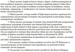
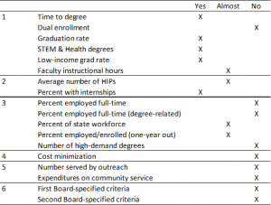
Governor Walker’s budget proposal would create a performance-based funding (PBF) system to allocate the $42.5 million in new money proposed for the 2017-19 biennium. There are six broad funding categories that generate 18 different metrics, depending how you want to count them:

Only 5 of these 18 metrics are currently available in the University of Wisconsin System Accountability Dashboard:

  1. Length of time to obtain a degree
  2. Percentage of students completing degrees (within four and six years)
  3. Percentage of students awarded degrees in healthcare & STEM
  4. Low-income student graduation rate
  5. Percentage of students who participated in internships

The remaining 13 metrics are either unavailable in the Dashboard, or they are “almost” there. By “almost,” I mean there’s an alternative measure that is not quite the same as what is defined in the budget proposal.

Table 1: Mapping PBF indicators to Accountability Dashboard

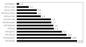
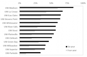
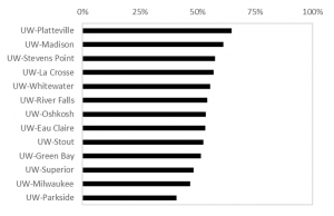
Using data from the Accountability Dashboard, I ranked each campus according to the five indicators in the “yes” column. Below is a summary of those results, showing the average rank across these five indicators.

Figure 1: Average rank on five key performance indicators

Across these five indicators, UW-Madison ranked at the top with an average rank of 1.5. Meanwhile, UW-Parkside ranked last with an average rank of 11.9 on these five. Notably, these five indicators would distribute between 30 and 40 percent of the total PBF allocation. It is possible, but I think unlikely, that calculations based on the other metrics would reverse these rankings (e.g., Parkside finishing first and Madison last).

Metric #1: Time-to-degree

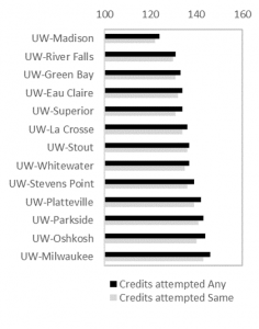
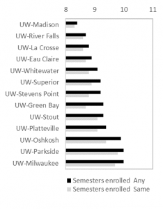
The Dashboard provides two ways to measure time-to-degree: credit hours attempted and semesters enrolled to graduation. In both cases, this metric follows cohorts of first-time, full-time students from the time they enter a UW System institution until graduation (in 2015-16). Not all students stay at the same college for their entire academic career, so this data is broken down for those who stay at the “same” college and those who ended up at “any” UW System university.

Figure 2: Credit hours attempted [left] and semesters to degree [right]


In each case, UW-Madison ranks first and UW-Milwaukee/UW-Parkside last. The choice of metric will matter in many cases. For example, UW-LaCrosse and UW-River Falls will tie if the Regents choose to use “semesters enrolled at the same institution,” but River Falls will rank higher than LaCrosse if completion at any campus is chosen. It is best to use “any institution” on this metric, given the magnitude of swirling and transferring that takes place in (and is encouraged by) systems of higher education.

Metric #2: Graduation rates

This metric follows each cohort of first-time, full-time students who begin college in a given academic year. Unlike the previous metric, this does not follow students who graduate from the “same” or from “any” UW institution. Instead, it only reports those who finish (within four or six years) at the same college where they began.

This metric is known as the Student Right to Know graduation rate metric, which under-counts the true graduation rate of public four-year universities by about 10 percentage points. Failing to account for transfer students or those who may were not first-time/full-time will play to the advantage of institutions enrolling “traditional” students (like UW-Madison). Adjusting this metric for open-access colleges and those serving post-traditional students would result in different and more accurate results that, in turn, will change the rank ordering.

Also note, the budget proposal calls for using three-year graduation rates, but this data is not reported in the Accountability Dashboard.

Metric #3: Share of degrees in Healthcare & STEM

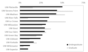
This metric is a bit more complicated than I initially expected. The budget proposal does not differentiate between undergraduate and graduate students, though the Dashboard does (fortunately). Similarly, it is unclear whether “STEM” should be measured separately from “Healthcare” — or whether they should be combined. For simplicity, I combined them below and differentiate between undergrad and grad:

If one were to rank colleges by undergraduate Healthcare & STEM (combined), then Platteville and Stevens Point come in first and second, respectively. But if it includes graduate students, then UW-Madison would take third  and UW-LaCrosse second. It will be important for policymakers to clarify this metric since it is clear from the chart that rank orders will bounce around considerably depending on how this is measured.

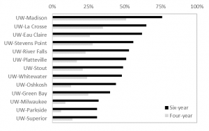
Metric #4: Low-income student graduation rate

This metric is the same as Metric #2, but with an emphasis on Pell Grant recipients as the proxy for “low-income” (which is not without its own shortcomings). Nevertheless, using six-year graduation rates results in the same Top Four colleges as the other graduation rate metric. However, UW-Whitewater drops three places while UW-Platteville and UW-River Falls improve their rankings.

As a side note, I was impressed the Dashboard follows Pell graduation rates from the late 1970s, when the program was first created. This is a real treasure, as the federal government only recently began reporting Pell graduation rates in IPEDS. Kudos to the System data folks!

Metric #5: Percent doing internships

This metric is based on self-reported data from the National Survey of Student Engagement (NSSE). Here, UW-Platteville takes first place with having the highest share of seniors reporting they participated in an “internship or field experience.”

Technically, NSSE asks if students “participate in an internship, co-op, field experience, student teaching, or clinical placement.” And respondents can choose one of four options: done/in progress; plan to do; do not plan to do; or have not decided.

NSSE is not designed to be used in high-stakes accountability regimes like PBF. The main reason is that most of the variation in student responses occurs within (rather than between) campuses. Because of this, NSSE results are more useful for internal assessment and planning purposes and not for ranking colleges.

Other metrics not discussed here

There are 13 other metrics either not reported or “almost” reported in the Accountability Dashboard. In a future post, I’ll take a crack at the “almost” reported figures. For example, faculty instruction is reported in the Dashboard, but it only includes UW-Madison and UW-Milwaukee and then lumps together all other campuses in the system into a single “comprehensive” institution. Similarly, the average number of High Impact Practices (HIPs) is unavailable, but we can get the percentage of NSSE respondents experiencing at least one HIP. The percentage of Wisconsin’s workforce who graduated from a UW campus in the last five years (also an Act 55 reporting requirement) requires us to know the right denominator. But the Dashboard doesn’t tell us this: it only tells us the share of bachelor’s degree recipients living in the state (e.g., what if an alumni is out of the labor force; what age groups should be included; etc.?). Finally, it may be possible to use campus surveys to calculate the share of alumni working or continuing their education, but ideally this and several of the other workforce indicators would be answered via student unit record database rather than self-reported figures.

What’s next?

If approved in its current form, the Board of Regents would use these metrics to allocate PBF funds to campuses. The Board of Regents would also need to propose to the Department of Administration a plan for allocating PBF funds based on the rankings. For example, the plan would spell out exactly how much funding a campus will receive for getting 1st place on a particular metric…and how much (if any) will be allocated for those in last place.

The Regents need to figure this out and submit their plan to the Department of Administration by January 1, 2018, or in about 300 days from today. This obviously eats into the upcoming fiscal year, meaning all $42.5 million will be disbursed via PBF in 2018-19 (rather than $21.25 per year):


State funding trends for the UW System

Governor Walker released his budget proposal yesterday, which includes about $138.5 million for the University of Wisconsin System (UWS) over the next two years.

This $138.5 is broken down into four main buckets:

  • $50 million from a lapse (i.e., funds promised but never delivered last biennium)
  • $42.5 million for a new performance-based funding program
  • $35 million to reduce tuition sticker-price by 5%
  • $11 million for employee compensation

There are several other items worth following, including opting out of allocable student fees, faculty workload monitoring, mandating internships, having 60% of academic programs offer 3-year bachelor’s degrees by 2020, and providing financial aid for Flex Option students.

But for now, let’s focus on these bullet points and situate this budget proposal in the broader context of historical General Purpose Revenue (GPR) funding for UWS.

A quick detour/primer on GPR:  The state of Wisconsin generates most of its GPR via individual income and sales tax (85% of total GPR), but it also supplements with corporate tax (7%), excise tax (5%), and other sources of revenue (4%). When the legislature and governor finalize the budget, GPR funds are then appropriated to help UWS cover the costs of delivering higher education, namely by covering the salaries, wages, and benefits for faculty and staff while also subsidizing campus operations/maintenance and debt service expenses.

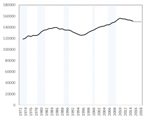
When the UWS was created in 1973, nearly 120,000 full-time equivalent students (FTE) enrolled across all campuses. Enrollments grew until the mid 1980s, flattened and dipped until the early 2000s when it steadily rose until after the Great Recession. Since 2010, enrollments have been slowly declining and the most recent data shows about 150,000 FTE are enrolled across the system. The dotted line is simply a flat line from the most recent enrollment level, as we should not expect much enrollment growth for the foreseeable future.

Figure 1: FTE enrollment in UWS

Source: UW System Accountability Dashboard

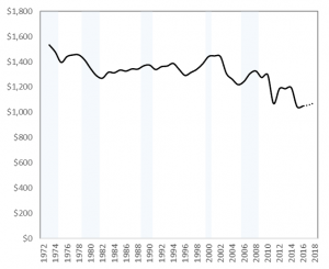
Despite this long-term enrollment growth, GPR revenue has steadily declined over time, shown in Figure 2.

Figure 2: GPR funding levels for UWS (2016 dollars, mil.)

Source: Wisconsin Legislative Fiscal Bureau , LFB Informational Paper #32, and Governor’s budget.

The small dotted line at the end represents Governor Walker’s recent budget proposal, which would appropriate $1.057 billion and $1.076 billion in fiscal years 2017 and 2018, respectively. This budget proposal would bring Wisconsin back to 2010 levels and about $170 million behind pre-recession levels. About 32,000 more FTE students enroll in the UWS today compared to 1973, yet GPR funds are about $500 million lower than that year.

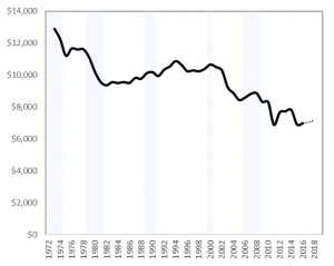
This means state investment is not keeping pace with enrollment growth, as shown in Figure 3. In the 1970s and 1980s, the state invested between $10,000 and $12,000 per FTE, but this changed around 2000 when per-FTE investment has steadily eroded.

Figure 3: GPR appropriations per FTE (2016 dollars)

Source: UW System Accountability Dashboard and LFB (see Figures 1 and 2 sources)

Unlike some other public services, colleges and universities are able to generate revenue via user-fees (tuition and fees). So, as state funding erodes, these user-fees have risen and students are now investing more in the UWS than the state of Wisconsin.

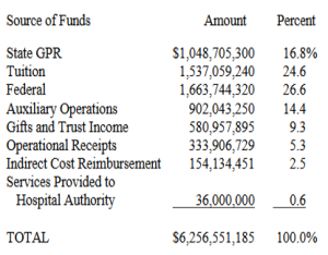
Below are two figures illustrating this point. Figure 4 shows all funds for the UWS, which sums to over $6 billion. State GPR covers about 17% of the total budget, whereas students cover about 25%. These funds (tuition and GPR) cover the core instructional costs for undergraduate education and it is what academic and non-academic units on campus use to deliver high-quality education. The other funds listed below are neither fungible nor targeted solely for undergraduate education: federal research grants, financial aid, and gifts/trust income are restricted for specific uses; auxiliaries are self-sustaining enterprises and cost recovery/operational receipts are project and program specific.

Tuition and GPR are the most important resources UWS campuses have available for ensuring classes are available, faculty and staff can deliver high quality services, and that students are well prepared for life after college. And research consistently shows state investment pays off by improving access, degree completion, shortening time-to-degree, so there is good evidence to support this investment. Tuition increases can discourage students from enrolling, but this can be counteracted by investing in student financial aid programs (particularly need-based aid).

Figure 4: UWS All-Fund Operating Budget (2016-17)

Source: Wisconsin Legislative Fiscal Bureau (2017). Informational Paper #32.

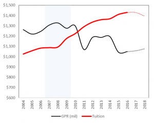
Figure 4 shows that student’s tuition revenue ($1.54 billion) now exceeds state investment ($1.05 billion). But when did this tipping point happen for the UWS? Have students always carried a larger share than the state? Due to data unavailability, the chart below only shows tuition and GPR from 2004 forward.

Figure 5: Total UWS revenue from tuition and GPR (2016 dollars, mil.)

Source: LFB Informational Paper #32, Table 11.

I am in the process of documenting years prior to 2004, but this shows clearly that the tipping point occurred in 2010, when students first began carrying a larger share of the UWS budget than Wisconsin. And this gap has grown over time, where students now pay about $1.50 for each $1.00 Wisconsin invests in the UWS.

The dotted lines in Figure 5 represent projections based on Governor Walker’s budget. It includes the $21.25 million of performance-based funding for 2017 and 2018, respectively. It also includes the $50 million funding lapse and the anticipated $11 million (for employee compensation) based on the Governor’s estimated cost savings from self-insurance. It also accounts for the 5% decrease in sticker-price tuition, which would occur in 2018.

It is hard to estimate what the $35 million (5% reduction) in tuition would look like in practice since sticker-price tuition is not a good proxy for net tuition revenue. A student could be charged a lower sticker price, yet still end up paying more tuition if financial aid does not fill unmet financial needs. To bring the evidence base to bear on this budget proposal, two recommendations emerge:

  • The $35 million in tuition reductions would be better targeted to need-based financial aid (via HEAB’s Wisconsin Grant program) which has lost its purchasing power over the years. This type of aid has also been shown to increase degree completion, so it would be an effective and efficient way to target resources to the most price-sensitive students.
  • The $92.5 million from the prior budget lapse and the new performance funding model would likely go further if it was targeted to capacity-constrained campuses that have been most affected by recent budgetary cuts. Making these colleges whole (or working to that end) would make more courses available for students while helping campuses provide high-quality academic and student support services to ensure timely (and more affordable) degree completion. Targeting resources into these “shovel-ready” projects will generate large private and social returns for the state of Wisconsin.

Data (see figures above for sources)

Year GPR
(2016 $, mil)
Tuition
(2016 $, mil)
FTE GPR per FTE Tuition per FTE
1973 1533 118787 12908
1974 1478 120551 12261
1975 1396 124389 11221
1976 1442 123559 11673
1977 1455 125361 11608
1978 1455 125134 11628
1979 1414 127094 11126
1980 1346 131630 10226
1981 1290 134652 9578
1982 1270 135591 9369
1983 1317 137675 9564
1984 1312 138042 9508
1985 1335 139472 9569
1986 1326 139371 9516
1987 1344 136722 9829
1988 1342 137222 9780
1989 1369 135116 10129
1990 1374 134908 10187
1991 1339 134511 9953
1992 1362 131640 10346
1993 1367 129566 10553
1994 1388 127494 10885
1995 1339 125754 10649
1996 1292 126007 10254
1997 1316 127649 10306
1998 1341 130898 10243
1999 1385 133235 10394
2000 1443 135205 10670
2001 1447 137730 10507
2002 1442 140000 10299
2003 1308 141500 9245
2004 1262 1025 142209 8871 7211
2005 1219 1057 144298 8445 7326
2006 1244 1083 144814 8592 7477
2007 1306 1088 147956 8829 7351
2008 1327 1094 149493 8875 7317
2009 1275 1176 153193 8323 7678
2010 1298 1224 156039 8318 7842
2011 1069 1290 155163 6888 8315
2012 1187 1335 154843 7664 8624
2013 1186 1359 153252 7741 8867
2014 1195 1368 152773 7820 8954
2015 1043 1410 150832 6914 9348
2016 1049 1430 150000 6991
2017 (est) 1057 1430 150000 7046
2018 (est) 1076 1395 150000 7170