Each year, State Higher Education Executive Officers (SHEEO) produces the go-to guide for state-level trends in higher education finance, downloadable and interactive data here.
Using this data, I created the following motion chart where each bubble represents a state. Pressing the play button shows how appropriations (x-axis) and net tuition revenue (y-axis) change over time.
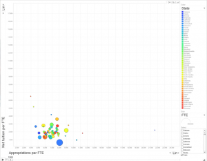
You can select individual states and change the bubble color/size. All financial data are presented in 2017 dollars based on CPI and the “tuition-to-appropriations” ratio is simply that: net tuition relative to net appropriations, where values over 1 indicate the state generates more revenue from tuition than it appropriates. For more details on the data, see their report.
I hope you find this tool helpful! I like using it as a teaching tool, so please feel free to use and share. I sometimes run into trouble depending on the browser I’m using, so just a heads-up on that front. Unfortunately, Google retired Motion Charts, but I was able to update this with the most recent data so hopefully it has some shelf life.
Please let me know if you see any bugs or if you find interesting patterns!