Yearly Archives: 2017

Community colleges and upward mobility

Below is a map identifying colleges operating in education deserts, or commuting zones where there are either: a) zero public colleges or b) a single community college is the only broad-access public option. This definition gives a useful but certainly not comprehensive view into communities around the country where prospective students’ choices are most constrained.

(Tableau page here)

But I do not believe that having fewer choices necessarily means students’ outcomes will be poor. It certainly may, but this is an empirical question that I don’t think has been closely examined. It turns out, I’m finding community colleges located in these deserts have higher than average mobility rates. And this is even after controlling for the local community zone mobility rate and a rich set of college-level covariates (including transfer-out graduation rates).

This is from my ongoing work for an upcoming conference at William & Mary on higher education and social mobility. For that conference, I’ll be presenting preliminary findings from what I’ve learned after merging IPEDS, Scorecard, and mobility report card data. I’m still sorting through it all, but it seems pretty consistent with Chetty et al’s findings that open-access colleges (especially when they’re the only public game in town) have high mobility rates.

I wanted to share this map to see if anybody notices anything strange. IPEDS and Scorecard don’t include satellite campuses and in some cases they merge campuses to central offices that may artificially result in a desert due to reporting issues. For example, Indiana’s Ivy Tech Community Colleges stopped reporting campus-level data in 2011 when they centralized their Program Participation Agreement, meaning it looks like the only Ivy Tech is in Indianapolis when we know they’re located all over the state. I’ve tried to adjust for some of the big problems like this one, but am still fine-tuning others (e.g., cleaning up some of the exclusively online colleges, etc.).

Feedback welcome!

March FAFSA deadlines – Part II

Each Friday, the US Department of Education publishes FAFSA filing data for all high schools in the country. We have been using this data to examine trends in filing, both for prior cycles and the the current (2017-18) cycle.

Last Friday, we presented at the AEFP conference or working paper (here) on filing rates and we thought it would be fun to throw in a slide on the new data that was released earlier that morning. We wanted to do that because it was the first look at filing since the IRS and Department of Education suspended the Data Retrieval Tool (DRT) on March 3rd. This tool made it easier for filers to import their tax records, which in turn should help students complete the form and reduce the need for verification.

In that presentation we shared the following slide, saying the dip corresponded with the DRT suspension.

In our discussion and in the following conversations, we pointed out that some states have March deadlines that could be behind the spike and drop we see here. Attendees at the session also noted that the drop could simply be a result of secular trends, rather than the tool being unavailable. This is what we loved so much about the conference — we could puzzle together on an ongoing policy issue and we could discuss appropriate research designs for disentangling secular trends from the “treatment” effect.

I am still in conference mode, so I was eager to follow up on this when I returned home. Here is a quick look at those secular trends comparing states with early March deadlines (CA, ID, IN, MD, MI, OR, WV) to all other states.

This chart is a little hard to read, but the left shows last year’s cycle and the right is this year’s. We’re looking at the week-to-week percentage point change in FAFSA completions among high school seniors.

The dotted line represents states with early March filing dates, and sure enough we see the early-March spike in both cycles. And, as expected, we don’t see that spike in other states.

But notice one thing: the weekly trends show much steeper changes than this year’s cycle. This is because last year was much more condensed and this year is spread out over three additional months.

The March spike last year went from 21% to 36%, a 14 percentage point bump in a single week! This year, the bump is much smaller, but it is still large relative to other weeks: a 9 ppt bump.

I wanted to show these big picture trends just to get the complete cycle in our minds. But this is hard to see in the above chart, so let’s zoom in.

We see the steep weekly declines in the 2016-17 cycle, where “early March” states basically flat-line by the end of the month. And the other states slow down to about 5 percent growth rates through April.

In the 2017-18 cycle, we still see that spike and we can anticipate the “early March” states will flat-line in the coming weeks. But it looks like the weekly trend holds pretty steady from week to week, hovering around 4 percent until February when it dips down to 2 percent.

[Side note: Look at the holiday season dip here, where filing drops in December. It does the same around Thanksgiving in the other chart above.]

The DRT suspension occurred on March 3rd, which likely had little to no effect on “early March” states so long as their deadlines were on March 1 or 2. But in the other states, we see March 10 (the week following the DRT suspension) reach its lowest point all cycle. The growth rate drops to 1.6% and we will monitor whether it rebounds in the coming weeks.

Considering that 1.78 million high school filers completed by June 30 last year, we have a long way to go to beat that level. We are currently at 1.62 million completions. That’s 160,000 a student gap that needs to be filled in 15 weeks. We can get there with a weekly growth rate less than 1 percent. We are already far above where we were last year in terms of completions, and I doubt weekly growth rates will slow below 1 percent. But this needs monitoring to be sure we’re on pace.

Whether the dip we saw this week was just part of the secular trend or whether it was because of the DRT suspension, we cannot say for sure with this descriptive analysis. We just wanted to share the data and bring this into the conversation. We don’t want to add noise or confusion to that conversation and we want to point out that it is hard to disentangle secular trends from the “treatment” effect. And that’s precisely why AEFP is a good conference to visit in order to share preliminary findings and to work through questions together.

We’ll keep monitoring this and piecing together as best of a picture as we can. Feedback welcome, as always!

Data:

Early March states Not early March states
Completed Submitted Completed Submitted
2016-17 cycle
January 8, 2016 30,515 36,605 104,872 125,304
January 15, 2016 54,412 64,185 185,193 216,134
January 22, 2016 77,754 91,606 257,083 299,213
January 29, 2016 104,997 123,217 339,954 392,649
February 5, 2016 139,918 163,356 451,996 518,168
February 12, 2016 167,847 194,819 544,011 618,187
February 19, 2016 202,543 234,077 650,209 736,784
February 26, 2016 244,641 280,501 745,762 837,536
March 4, 2016 332,235 383,092 865,845 967,066
March 11, 2016 351,423 402,080 918,114 1,020,316
March 18, 2016 362,821 412,751 969,787 1,074,355
March 25, 2016 370,270 416,572 1,010,295 1,110,564
April 1, 2016 374,809 420,089 1,051,186 1,152,268
2017-18 cycle
October 7, 2016 36,760 41,943 159,976 180,256
October 14, 2016 63,726 71,756 264,881 293,808
October 21, 2016 89,957 101,377 359,001 396,507
October 28, 2016 115,443 129,415 448,117 492,713
November 4, 2016 139,479 155,856 533,215 584,646
November 11, 2016 154,773 172,794 586,070 641,763
November 18, 2016 177,266 197,186 665,354 726,252
November 25, 2016 186,013 206,853 696,765 759,629
December 2, 2016 207,066 229,919 769,497 837,037
December 9, 2016 216,850 240,117 806,861 875,767
December 16, 2016 225,690 249,402 841,780 912,144
December 23, 2016 231,912 255,948 867,412 939,113
December 30, 2016 238,191 262,747 892,013 965,228
January 6, 2017 247,790 273,030 930,049 1,006,055
January 13, 2017 256,997 282,662 966,455 1,045,077
January 20, 2017 267,939 294,030 1,008,471 1,090,663
January 27, 2017 279,177 305,858 1,044,504 1,127,559
February 3, 2017 292,968 320,433 1,089,586 1,175,960
February 10, 2017 303,994 332,054 1,118,125 1,204,642
February 17, 2017 317,077 346,011 1,147,851 1,235,870
February 24, 2017 331,670 361,602 1,173,191 1,262,285
March 3, 2017 379,359 419,348 1,210,582 1,302,398
March 10, 2017 392,864 430,926 1,229,581 1,320,855


March FAFSA deadlines

A handful of state financial aid programs have early-March FAFSA filing deadlines, including some popular ones like California’s Cal Grant and West Virginia’s PROMISE scholarship.

Still other states (like Indiana and Texas) have mid-March deadlines that are now being pushed back to April due to the Data Retrieval Tool suspension.

Now that we have high school FAFSA filing data up to March 3rd from the Office of Federal Student Aid, we can see how filing spikes in the week(s) leading up to the deadline.

In California, about 201,000 high school seniors filed before the March 2nd deadline last year. But this year, that number is up about 10% and just shy of 224,000:

We see a similar spike in West Virginia, where FAFSA completions jump in the week or two prior to the deadline. Last year, about 8,300 high school seniors applied by the deadline and this year that number rose to almost 9,500 (a 13% jump).

Indiana’s original deadline was March 15th, and we can anticipate a similar jump prior to the deadline. Last year, they had about 27,000 completions going into March and this spiked up to 37,500 after the deadline, which is about a 40% spike in volume over the course of two weeks. But with the DRT suspension, there’s a good chance this jump is stunted, we will see tomorrow. And kudos to Indiana for extending the deadline to April 15!

I am not quite sure how to make sense of Texas (said every non-Texan ever). But right from the start of the new filing cycle, Texas high school seniors completed a large number of FAFSAs during the fall. Even though their state’s deadline is March 15, more students filed by February this year than the total number of filers by April of last year. Way to go, Texas! Maybe Texas is just different, but it makes me think deadlines may not always be associated with spikes. I’m sure there’s a lot of nuance I’m missing here, but this one really intrigues me compared to the prior few states.

We’ll continue to monitor the post-DRT trend, where we will likely shift away from total completions and focus on the percent of submissions that were completed. I can imagine there were spikes in submissions, but flat lines for completions in the week after March 3rd (when the DRT went down).

A closer look at WI’s proposed PBF metrics and rankings

Governor Walker’s budget proposal would create a performance-based funding (PBF) system to allocate the $42.5 million in new money proposed for the 2017-19 biennium. There are six broad funding categories that generate 18 different metrics, depending how you want to count them:

Only 5 of these 18 metrics are currently available in the University of Wisconsin System Accountability Dashboard:

  1. Length of time to obtain a degree
  2. Percentage of students completing degrees (within four and six years)
  3. Percentage of students awarded degrees in healthcare & STEM
  4. Low-income student graduation rate
  5. Percentage of students who participated in internships

The remaining 13 metrics are either unavailable in the Dashboard, or they are “almost” there. By “almost,” I mean there’s an alternative measure that is not quite the same as what is defined in the budget proposal.

Table 1: Mapping PBF indicators to Accountability Dashboard

Using data from the Accountability Dashboard, I ranked each campus according to the five indicators in the “yes” column. Below is a summary of those results, showing the average rank across these five indicators.

Figure 1: Average rank on five key performance indicators

Across these five indicators, UW-Madison ranked at the top with an average rank of 1.5. Meanwhile, UW-Parkside ranked last with an average rank of 11.9 on these five. Notably, these five indicators would distribute between 30 and 40 percent of the total PBF allocation. It is possible, but I think unlikely, that calculations based on the other metrics would reverse these rankings (e.g., Parkside finishing first and Madison last).

Metric #1: Time-to-degree

The Dashboard provides two ways to measure time-to-degree: credit hours attempted and semesters enrolled to graduation. In both cases, this metric follows cohorts of first-time, full-time students from the time they enter a UW System institution until graduation (in 2015-16). Not all students stay at the same college for their entire academic career, so this data is broken down for those who stay at the “same” college and those who ended up at “any” UW System university.

Figure 2: Credit hours attempted [left] and semesters to degree [right]


In each case, UW-Madison ranks first and UW-Milwaukee/UW-Parkside last. The choice of metric will matter in many cases. For example, UW-LaCrosse and UW-River Falls will tie if the Regents choose to use “semesters enrolled at the same institution,” but River Falls will rank higher than LaCrosse if completion at any campus is chosen. It is best to use “any institution” on this metric, given the magnitude of swirling and transferring that takes place in (and is encouraged by) systems of higher education.

Metric #2: Graduation rates

This metric follows each cohort of first-time, full-time students who begin college in a given academic year. Unlike the previous metric, this does not follow students who graduate from the “same” or from “any” UW institution. Instead, it only reports those who finish (within four or six years) at the same college where they began.

This metric is known as the Student Right to Know graduation rate metric, which under-counts the true graduation rate of public four-year universities by about 10 percentage points. Failing to account for transfer students or those who may were not first-time/full-time will play to the advantage of institutions enrolling “traditional” students (like UW-Madison). Adjusting this metric for open-access colleges and those serving post-traditional students would result in different and more accurate results that, in turn, will change the rank ordering.

Also note, the budget proposal calls for using three-year graduation rates, but this data is not reported in the Accountability Dashboard.

Metric #3: Share of degrees in Healthcare & STEM

This metric is a bit more complicated than I initially expected. The budget proposal does not differentiate between undergraduate and graduate students, though the Dashboard does (fortunately). Similarly, it is unclear whether “STEM” should be measured separately from “Healthcare” — or whether they should be combined. For simplicity, I combined them below and differentiate between undergrad and grad:

If one were to rank colleges by undergraduate Healthcare & STEM (combined), then Platteville and Stevens Point come in first and second, respectively. But if it includes graduate students, then UW-Madison would take third  and UW-LaCrosse second. It will be important for policymakers to clarify this metric since it is clear from the chart that rank orders will bounce around considerably depending on how this is measured.

Metric #4: Low-income student graduation rate

This metric is the same as Metric #2, but with an emphasis on Pell Grant recipients as the proxy for “low-income” (which is not without its own shortcomings). Nevertheless, using six-year graduation rates results in the same Top Four colleges as the other graduation rate metric. However, UW-Whitewater drops three places while UW-Platteville and UW-River Falls improve their rankings.

As a side note, I was impressed the Dashboard follows Pell graduation rates from the late 1970s, when the program was first created. This is a real treasure, as the federal government only recently began reporting Pell graduation rates in IPEDS. Kudos to the System data folks!

Metric #5: Percent doing internships

This metric is based on self-reported data from the National Survey of Student Engagement (NSSE). Here, UW-Platteville takes first place with having the highest share of seniors reporting they participated in an “internship or field experience.”

Technically, NSSE asks if students “participate in an internship, co-op, field experience, student teaching, or clinical placement.” And respondents can choose one of four options: done/in progress; plan to do; do not plan to do; or have not decided.

NSSE is not designed to be used in high-stakes accountability regimes like PBF. The main reason is that most of the variation in student responses occurs within (rather than between) campuses. Because of this, NSSE results are more useful for internal assessment and planning purposes and not for ranking colleges.

Other metrics not discussed here

There are 13 other metrics either not reported or “almost” reported in the Accountability Dashboard. In a future post, I’ll take a crack at the “almost” reported figures. For example, faculty instruction is reported in the Dashboard, but it only includes UW-Madison and UW-Milwaukee and then lumps together all other campuses in the system into a single “comprehensive” institution. Similarly, the average number of High Impact Practices (HIPs) is unavailable, but we can get the percentage of NSSE respondents experiencing at least one HIP. The percentage of Wisconsin’s workforce who graduated from a UW campus in the last five years (also an Act 55 reporting requirement) requires us to know the right denominator. But the Dashboard doesn’t tell us this: it only tells us the share of bachelor’s degree recipients living in the state (e.g., what if an alumni is out of the labor force; what age groups should be included; etc.?). Finally, it may be possible to use campus surveys to calculate the share of alumni working or continuing their education, but ideally this and several of the other workforce indicators would be answered via student unit record database rather than self-reported figures.

What’s next?

If approved in its current form, the Board of Regents would use these metrics to allocate PBF funds to campuses. The Board of Regents would also need to propose to the Department of Administration a plan for allocating PBF funds based on the rankings. For example, the plan would spell out exactly how much funding a campus will receive for getting 1st place on a particular metric…and how much (if any) will be allocated for those in last place.

The Regents need to figure this out and submit their plan to the Department of Administration by January 1, 2018, or in about 300 days from today. This obviously eats into the upcoming fiscal year, meaning all $42.5 million will be disbursed via PBF in 2018-19 (rather than $21.25 per year):


State funding trends for the UW System

Governor Walker released his budget proposal yesterday, which includes about $138.5 million for the University of Wisconsin System (UWS) over the next two years.

This $138.5 is broken down into four main buckets:

  • $50 million from a lapse (i.e., funds promised but never delivered last biennium)
  • $42.5 million for a new performance-based funding program
  • $35 million to reduce tuition sticker-price by 5%
  • $11 million for employee compensation

There are several other items worth following, including opting out of allocable student fees, faculty workload monitoring, mandating internships, having 60% of academic programs offer 3-year bachelor’s degrees by 2020, and providing financial aid for Flex Option students.

But for now, let’s focus on these bullet points and situate this budget proposal in the broader context of historical General Purpose Revenue (GPR) funding for UWS.

A quick detour/primer on GPR:  The state of Wisconsin generates most of its GPR via individual income and sales tax (85% of total GPR), but it also supplements with corporate tax (7%), excise tax (5%), and other sources of revenue (4%). When the legislature and governor finalize the budget, GPR funds are then appropriated to help UWS cover the costs of delivering higher education, namely by covering the salaries, wages, and benefits for faculty and staff while also subsidizing campus operations/maintenance and debt service expenses.

When the UWS was created in 1973, nearly 120,000 full-time equivalent students (FTE) enrolled across all campuses. Enrollments grew until the mid 1980s, flattened and dipped until the early 2000s when it steadily rose until after the Great Recession. Since 2010, enrollments have been slowly declining and the most recent data shows about 150,000 FTE are enrolled across the system. The dotted line is simply a flat line from the most recent enrollment level, as we should not expect much enrollment growth for the foreseeable future.

Figure 1: FTE enrollment in UWS

Source: UW System Accountability Dashboard

Despite this long-term enrollment growth, GPR revenue has steadily declined over time, shown in Figure 2.

Figure 2: GPR funding levels for UWS (2016 dollars, mil.)

Source: Wisconsin Legislative Fiscal Bureau , LFB Informational Paper #32, and Governor’s budget.

The small dotted line at the end represents Governor Walker’s recent budget proposal, which would appropriate $1.057 billion and $1.076 billion in fiscal years 2017 and 2018, respectively. This budget proposal would bring Wisconsin back to 2010 levels and about $170 million behind pre-recession levels. About 32,000 more FTE students enroll in the UWS today compared to 1973, yet GPR funds are about $500 million lower than that year.

This means state investment is not keeping pace with enrollment growth, as shown in Figure 3. In the 1970s and 1980s, the state invested between $10,000 and $12,000 per FTE, but this changed around 2000 when per-FTE investment has steadily eroded.

Figure 3: GPR appropriations per FTE (2016 dollars)

Source: UW System Accountability Dashboard and LFB (see Figures 1 and 2 sources)

Unlike some other public services, colleges and universities are able to generate revenue via user-fees (tuition and fees). So, as state funding erodes, these user-fees have risen and students are now investing more in the UWS than the state of Wisconsin.

Below are two figures illustrating this point. Figure 4 shows all funds for the UWS, which sums to over $6 billion. State GPR covers about 17% of the total budget, whereas students cover about 25%. These funds (tuition and GPR) cover the core instructional costs for undergraduate education and it is what academic and non-academic units on campus use to deliver high-quality education. The other funds listed below are neither fungible nor targeted solely for undergraduate education: federal research grants, financial aid, and gifts/trust income are restricted for specific uses; auxiliaries are self-sustaining enterprises and cost recovery/operational receipts are project and program specific.

Tuition and GPR are the most important resources UWS campuses have available for ensuring classes are available, faculty and staff can deliver high quality services, and that students are well prepared for life after college. And research consistently shows state investment pays off by improving access, degree completion, shortening time-to-degree, so there is good evidence to support this investment. Tuition increases can discourage students from enrolling, but this can be counteracted by investing in student financial aid programs (particularly need-based aid).

Figure 4: UWS All-Fund Operating Budget (2016-17)

Source: Wisconsin Legislative Fiscal Bureau (2017). Informational Paper #32.

Figure 4 shows that student’s tuition revenue ($1.54 billion) now exceeds state investment ($1.05 billion). But when did this tipping point happen for the UWS? Have students always carried a larger share than the state? Due to data unavailability, the chart below only shows tuition and GPR from 2004 forward.

Figure 5: Total UWS revenue from tuition and GPR (2016 dollars, mil.)

Source: LFB Informational Paper #32, Table 11.

I am in the process of documenting years prior to 2004, but this shows clearly that the tipping point occurred in 2010, when students first began carrying a larger share of the UWS budget than Wisconsin. And this gap has grown over time, where students now pay about $1.50 for each $1.00 Wisconsin invests in the UWS.

The dotted lines in Figure 5 represent projections based on Governor Walker’s budget. It includes the $21.25 million of performance-based funding for 2017 and 2018, respectively. It also includes the $50 million funding lapse and the anticipated $11 million (for employee compensation) based on the Governor’s estimated cost savings from self-insurance. It also accounts for the 5% decrease in sticker-price tuition, which would occur in 2018.

It is hard to estimate what the $35 million (5% reduction) in tuition would look like in practice since sticker-price tuition is not a good proxy for net tuition revenue. A student could be charged a lower sticker price, yet still end up paying more tuition if financial aid does not fill unmet financial needs. To bring the evidence base to bear on this budget proposal, two recommendations emerge:

  • The $35 million in tuition reductions would be better targeted to need-based financial aid (via HEAB’s Wisconsin Grant program) which has lost its purchasing power over the years. This type of aid has also been shown to increase degree completion, so it would be an effective and efficient way to target resources to the most price-sensitive students.
  • The $92.5 million from the prior budget lapse and the new performance funding model would likely go further if it was targeted to capacity-constrained campuses that have been most affected by recent budgetary cuts. Making these colleges whole (or working to that end) would make more courses available for students while helping campuses provide high-quality academic and student support services to ensure timely (and more affordable) degree completion. Targeting resources into these “shovel-ready” projects will generate large private and social returns for the state of Wisconsin.

Data (see figures above for sources)

Year GPR
(2016 $, mil)
Tuition
(2016 $, mil)
FTE GPR per FTE Tuition per FTE
1973 1533 118787 12908
1974 1478 120551 12261
1975 1396 124389 11221
1976 1442 123559 11673
1977 1455 125361 11608
1978 1455 125134 11628
1979 1414 127094 11126
1980 1346 131630 10226
1981 1290 134652 9578
1982 1270 135591 9369
1983 1317 137675 9564
1984 1312 138042 9508
1985 1335 139472 9569
1986 1326 139371 9516
1987 1344 136722 9829
1988 1342 137222 9780
1989 1369 135116 10129
1990 1374 134908 10187
1991 1339 134511 9953
1992 1362 131640 10346
1993 1367 129566 10553
1994 1388 127494 10885
1995 1339 125754 10649
1996 1292 126007 10254
1997 1316 127649 10306
1998 1341 130898 10243
1999 1385 133235 10394
2000 1443 135205 10670
2001 1447 137730 10507
2002 1442 140000 10299
2003 1308 141500 9245
2004 1262 1025 142209 8871 7211
2005 1219 1057 144298 8445 7326
2006 1244 1083 144814 8592 7477
2007 1306 1088 147956 8829 7351
2008 1327 1094 149493 8875 7317
2009 1275 1176 153193 8323 7678
2010 1298 1224 156039 8318 7842
2011 1069 1290 155163 6888 8315
2012 1187 1335 154843 7664 8624
2013 1186 1359 153252 7741 8867
2014 1195 1368 152773 7820 8954
2015 1043 1410 150832 6914 9348
2016 1049 1430 150000 6991
2017 (est) 1057 1430 150000 7046
2018 (est) 1076 1395 150000 7170

Party control in Congress and State Legislatures (1978-2016)

In the politics of education course I teach this semester, I was looking for a nice overview of trends in party control for Congress and state legislatures. Just a simple chart showing trends in which party holds the majority in the House and Senate and whether similar trends occur in state legislatures. We often just focus on one or the other, but I want to see Congress and states on the same graph.

But I couldn’t quite find what I was looking for. So in its absence (and in losing patience digging around), I compiled data from the Senate and House history pages along with the National Conference of State Legislatures partisan composition page.

A few notes about what’s being measured here. For the states, NCSL tells us whether both chambers are controlled by a given party. If Democrats hold both chambers, then the state is coded as “Democrat.” States are coded as “Split” if Democrats carry one chamber and Republicans the other. Nebraska is omitted because it has a non-partisan unicameral legislature, but I put them in the “Split plus NE” category just so we have all 50 states. And all data are as of January of the given year, except 2016, which uses December to reflect the outcomes of the most recent election:

In this time frame, Democrats held party control in state legislatures until the early 1990s. At that time, states were becoming more split and slowly more Republican-controlled until Democrats gained a short-lived advantage around 2006. This results in an inverse portrait where 31 states were controlled by Democrats in 1978 and, fast-forwarding to the post-2016 election, 32 states are now controlled by Republicans.

Shifting gears to Congress, the chart shows the percentage of members from each of the two parties:

In the Senate during this period, Democrats went from a high of 58 of seats in 1978 down to 46 in the current (115th) Congress. In the House, we see similar trends where Democrats held 64% of seats in 1978 and this has slowly dropped to about 45% today (194 D to 241 R).

But these three charts are hard to put the full picture together, so the following combines them into a single visualization that I think tells the story a little clearer:

This chart shows three lines: the two light blue lines show the percent of Senate and House seats held by Democrats, the dark blue is the share of state with Democratic party control. Same goes for Republicans:

For a brief period in the early 1980s, Democrats held majorities in the House and Senate while also having party control of the majority of state legislatures. This is now the situation for Republicans, who have picked up state legislative party control and have gained majorities in Congress since 2010-2012.

These trends aren’t really surprising since we know Republicans have control of legislative chambers both in the states and in Congress. But how this has changed over time, the magnitude of growth, and overlaying these trends onto the same graph is something new to me. This helps me frame our class discussions around the broader political, social, demographic, and economic mechanisms driving these changes. I am no political scientist, so I can’t get too deep in the weeds, but this can help me frame some of our discussions around the broader partisan context in which higher education policy is being made.

Sources: Senate: https://www.senate.gov/history/partydiv.htm, House: http://history.house.gov/Institution/Party-Divisions/74-Present/, NCSL: http://www.ncsl.org/research/about-state-legislatures/partisan-composition.aspx

Data:

Senate House State Legislatures
Dem Rep Oth Dem Rep Oth Dem Rep Split+NE
1978 58 41 1 277 158 0 31 11 8
1980 46 53 1 242 192 1 28 15 7
1982 46 54 0 269 166 0 34 10 6
1984 47 53 0 253 182 0 28 10 12
1986 55 45 0 258 177 0 27 9 14
1988 55 45 0 260 175 0 29 8 13
1990 56 44 0 267 167 1 29 6 15
1992 57 43 0 258 176 1 26 7 17
1994 48 52 0 204 230 1 22 15 13
1996 45 55 0 207 226 2 20 17 13
1998 45 55 0 211 223 1 20 17 13
2000 50 50 0 212 221 2 16 18 16
2002 48 51 1 205 229 1 16 21 13
2004 44 55 1 202 231 2 19 20 11
2006 49 49 2 233 198 4 23 16 11
2008 57 41 2 256 178 1 27 14 9
2010 51 47 2 193 242 0 27 14 9
2012 54 45 1 201 234 0 15 27 8
2014 44 54 2 188 246 1 19 26 5
2016 46 52 2 194 241 0 14 32 4

FAFSA filing update – Wisconsin and Tennessee

We are now 17 weeks into the 2017-18 FAFSA Cycle and about 1.27 million high school seniors have completed the form, according to FSA’s data.

Below is a chart comparing this cycle to last year’s (which began on Jan 1). We are far above where we were last January and about 150,000 behind where we were in April, when most states’ filing deadlines have passed.  The solid black line will continue to slope upward, and when April comes we will be able to make a better comparison between the two cycles.

But in some states, we can already start to make preliminary comparisons since their filing deadlines have already passed. In Tennessee, for example, Jan 17 was the deadline for the Tennessee Promise program and we now have data that spans this deadline for both cycles (last year’s deadline was in February, so this chart shows “weeks from deadline” instead of calendar weeks).

In the current cycle, we see a sharper spike in the weeks leading up to the deadline, whereas last cycle was not quite as pronounced. Last year, the deadline was followed by a plateau, so we will be monitoring other states with deadlines to see whether similar patterns hold.

Regardless, nearly 50,000 Tennessee high school seniors filed the FAFSA this cycle compared to the nearly 38,000 who filed prior to last year’s deadline. This 12,000 differential is a large bump and likely due to a number of factors including greater awareness of the Tennessee Promise program, outreach efforts, the number of high school seniors, FAFSA changes, etc. We are unable to say with this data, but it sure is a promising trend to see!

But several states do not have filing deadlines and instead use a first-come, first-serve basis for awarding financial aid. Wisconsin is one example and, unlike Tennessee, we do not see a surge in filing. Instead, we see more of a parallel filing trend that slowly converges.

Here 17 weeks into the current cycle, we have about the same number of filers as we saw last April (Week 14 of that cycle). In states without filing deadlines, we might expect to see flatter growth but we are unsure if this will plateau or steadily slow its growth rate until the FAFSA cycle ends.

We are thinking through the consequences of using hard (TN) versus soft (WI) filing deadlines and will eventually be able to see whether overall filing rates differ by state policy design. Maybe the won’t vary, but it’s worth a look!

For example, it seems possible a hard-deadline state should have higher overall filing rates since students may be more aware of the “use it or lose it” consequences of missing the deadline. But it is also possible hard-deadline states end up with lower overall filing rates for the exact same reason — students who miss the deadline may be out of luck and missing out will result in lower overall filing rates. We don’t know yet, and maybe we don’t detect any patterns, but this project is one step in that direction to dig into new areas of financial aid research.

Data:

week 17 summary.xlsx

Getting oriented to the new college mobility data

I have been digging into the new income mobility paper, just trying to wrap my head the details while not losing the forest for the trees. This is a remarkable study and the authors provide institution-level public data files here. There are 11 different files, so it takes some time getting familiar with their layout and to see which ones they used in the Upshot.

This post hopefully helps other folks navigate the data or offer me some insights into what you’ve found as you work through it. But here goes, I’ll replicate findings for Washington University in St. Louis and for California State University since these two got a lot of attention in the NYT article.

Replicating family income

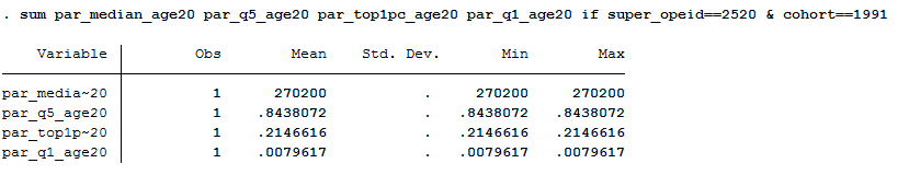
According to Wash U’s Upshot page, the median family income of students is $272,000 and 84% come from the top quintile of the income distribution. To show just how lopsided their enrollments are in terms of economic diversity, consider this: about 22% of their student body comes from the top 1% of the income distribution, while less than 1% come from the bottom 20%!

Table 5 is where to find this data. Wash U’s identification number is “2520” and the Upshot uses the 1991 birth cohort, so be sure to restrict the panel to those criteria. These variables measure median parental household income (par_median_age20), along with the fraction of students enrolled by income quintile (par_q5_age20 and par_q1_age20) and top 1% (par_top1pc_age20) according to where the student was enrolled at age 20:

washu_tab5

Replicating upward mobility rates

The Upshot also displays two different mobility rate metrics:

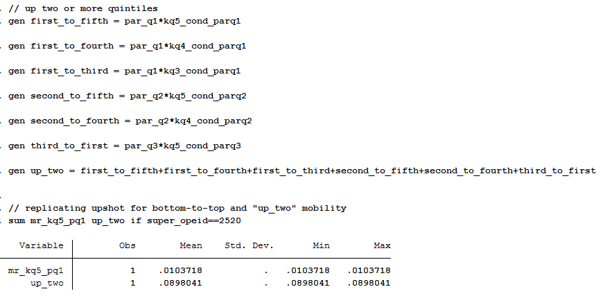
The first is “moving up two or more quintiles,” and about 9 in 100 students come from the bottom and end up at least two quintiles higher as adults (30-somethings).The Upshot calls this the overall mobility rate.

The second is the same rate used in the Chetty et al paper, which is “moved from the bottom to top income quintile.” About 1 in 100 students come from the bottom and end up at the top quintile of the income distribution.

If I had to choose one of these measures, I would prefer the first since upward mobility doesn’t always have to be a rags to riches story. Moving from the bottom 20% to the top 40% is still upward mobility and wouldn’t be captured in the second measure.

Table 2 is where to find this mobility rate data. The paper explains how mobility rate is calculated as the product of access (fraction of students from bottom income quintile) and success rate (fraction of such students who reach the top income quintile as adults).

In the data, it’s easy to get bottom-to-top mobility rates (mr_kq5_pq1) that are used in the paper. But if you want to measure overall mobility (the first definition above), then you need to jump through some hoops — unless I overlooked a variable that does this already. You have to calculate each of the six possible ways a child can jump up two income quintiles: they can go from the bottom to the top three, or from the second-lowest to the top two, or from the third-lowest to the top.

gen_uptwo

Between Tables 2 and 5, you can pretty easily replicate some of the main data elements of the Upshot page. It took a little bit of a learning curve to search across all these files and figure out which variable to use and when, but hopefully this brief discussion helps validate your efforts if you’re trying to use this data for research. And of course, if you see I missed something, please let me know!

Using this data for research

Now that we know how to extract two different mobility rates and the fraction of students from various income quintiles for each college, we might be inclined to use this data in our own research. There is still a lot to learn about this data and it will take time to fully understand the strengths, limitations, and opportunities this dataset provides researchers. It’s a massive amount of information generated from sources that haven’t been used to date. So researchers will have a learning curve and I know I’m still trying to make sense of what’s in here and how it might be used for research. Here are a few helpful things I’m still working through:

1) Parent-child relationships

Each student is connected to a college via the 1098-T tax form and NSLDS Pell Grant reports. Colleges must report tuition payments for all students using the 1098-T form, and if a student paid no tuition the NSLDS record picks them up. The tax form includes the employer ID number (EIN) corresponding to where the student paid tuition, creating a “near complete roster of college attendance at all Title IV institutions in the US,” which is remarkable.

However, this does not mean the college where the student enrolled is available in the dataset. In Table 11, Chetty et al begin with 5,903 institutions. About 2,960 of these colleges have “insufficient data” to report in the final analysis. Another 576 colleges end up getting clustered with at least one more institution.

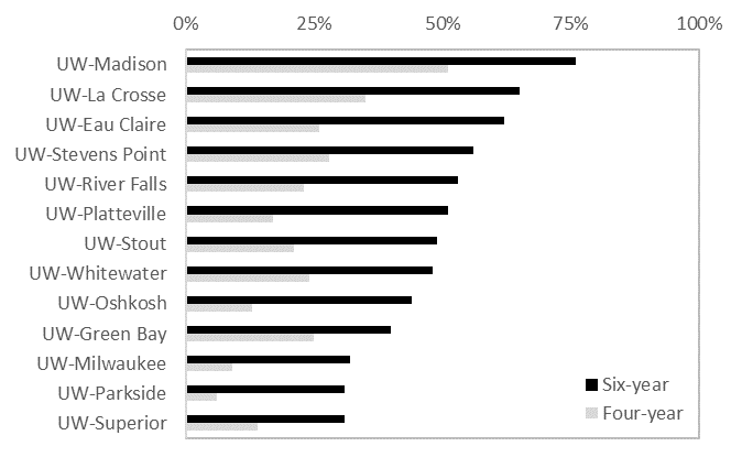
For the University of Wisconsin, all 13 public four-year universities and UW Colleges (the system’s community colleges) are all lumped together as a single observation. Indiana University, University of Pittsburgh, University of Massachusetts, University of Maine, University of Maryland, University of Minnesota, University of South Carolina, West Virginia University, Miami-Dade Community College, the University of Tennessee, and several more colleges are in a similar boat as Wisconsin: the data does not reflect individual institutions. Considering the heterogeneity within systems, these system-level mobility rates will not reflect the mobility rate of each individual campus.

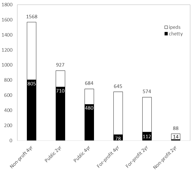
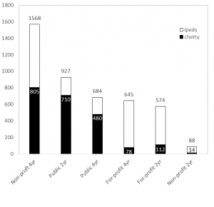
Here’s a better way to see it. Below is the total number of institutions (this time using unitid from IPEDS) by each sector. Two-year colleges include those that offer less-than two-year degrees. All are Title IV degree-granting institutions. Mapping Chetty et al’s data to this, we can see the data captures about 480 out of 684 (70%) public four-year universities but only half of non-profit (805 out of 1,568) and about 12% of for-profit four-year universities (78 of 645). Similar patterns occur in the two-year sector where about 77% of community/technical colleges are accounted for, but far lower rates in the private sectors:

ipeds_chetty

It is hard to tell the extent to which this matters, and maybe it doesn’t if we ascribe to the “some data is better than no data” argument (which I’m pretty sympathetic to in this case). But about 3.17 million students attend a collapsed institution, which is about 20% of the nation’s total enrollment. So given “University of Wisconsin System’s” bottom-to-top mobility rate of <1% and its overall mobility rate of 13%, I don’t know how to interpret this finding. Are the results driven by Madison’s campus? Milwaukee? Any of the others?

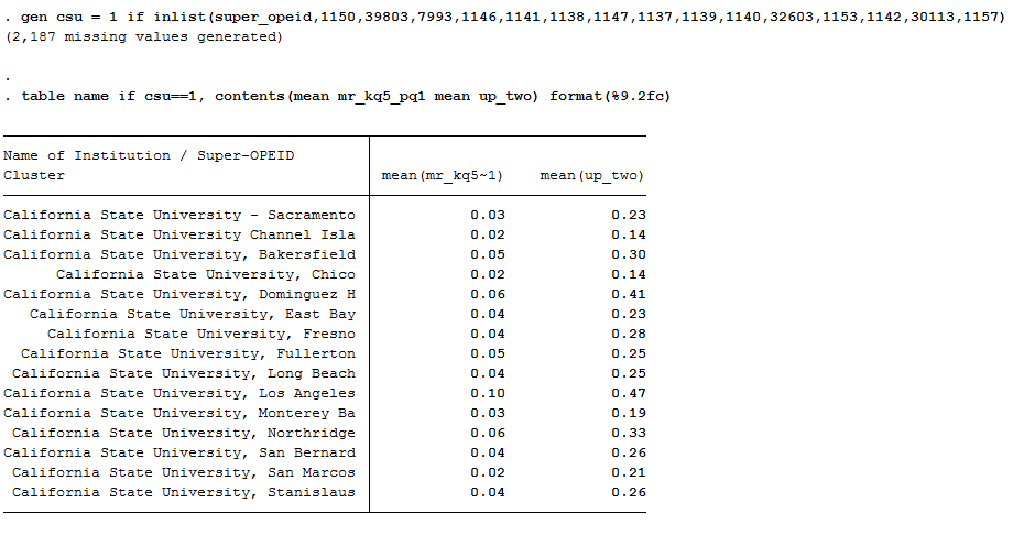
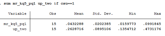
Let’s take the Cal State system as an example. Each campus is listed separately in the Chetty database and their mobility rates (bottom-to-top and overall) are below:

csu_opeid

We can see here the range of overall upward mobility (the right column) ranges from a low is 14% at CSU-Channel Islands to a high of 47% at CSU-Los Angeles. This is quite a bit of variation within a single system. If I lump these 15 universities together into “Cal State System” then our overall upward mobility score would be 26%, which doesn’t represent either campus’ experience very well:

csu_system

All of this is to say: be cautious working with parent-child relationships and realize this study only looks at about half of all colleges in the U.S. (depending on how we classify them).

2) Transfer and enrollment

The research team had to make some tough decisions about how to link students to their college. With nearly 40% of freshmen transferring within six years, should a student be matched to their original institution, the one they attended most often, the one they last enrolled in, or the one they earned a degree from? The paper and data files focus on the most-often attended college and the college last-attended at age 20 (they don’t give a lot of details, so you really have to read between the lines with some of this).

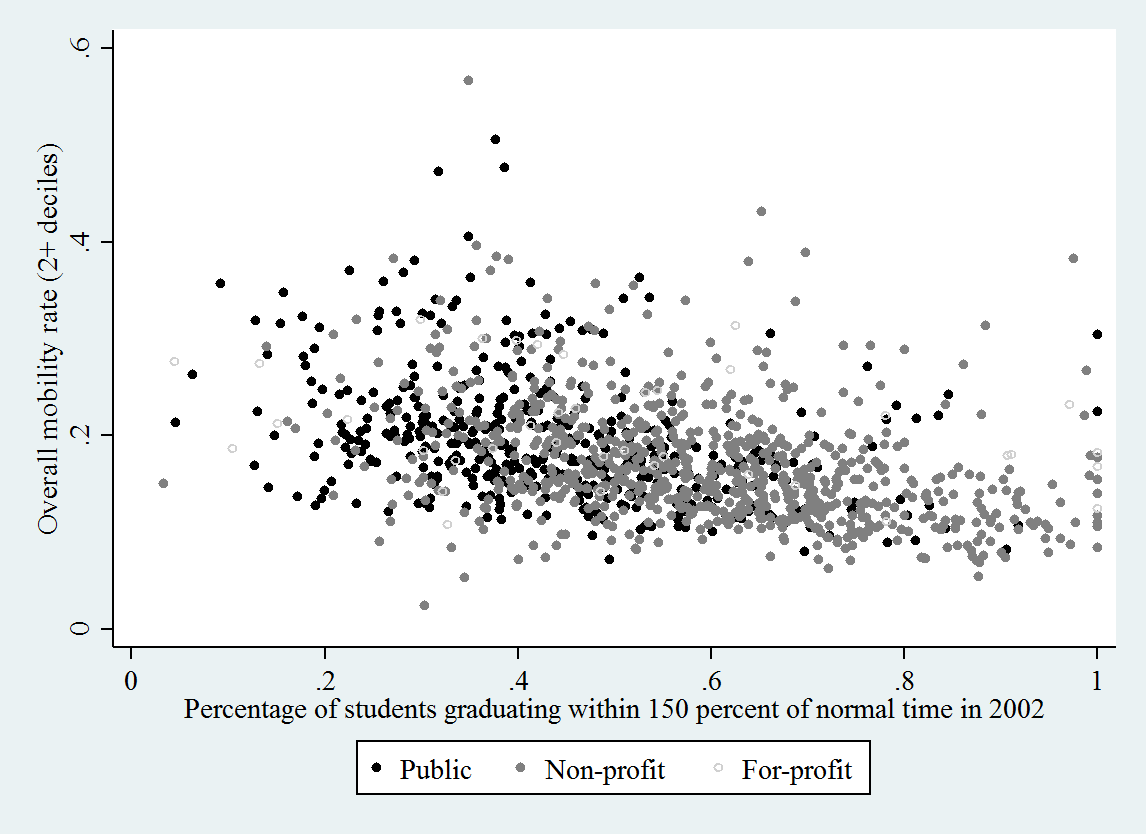
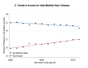
It is unclear whether or why one institution should be credited for upward mobility if their students attended multiple colleges. It is also unclear what mechanisms are at play when a student experiences upward mobility simply by attending (not completing) a college. Yet, that’s exactly what this study concludes — simply enrolling yields upward mobility. I don’t know how to make sense of this quite yet, but I found Figure IXC to be provocative. Despite the upward mobility gains documented throughout the paper, this figure shows how fewer low-income students are enrolling in high-mobility-rate colleges. The downward-sloping line shows how access is slowly (and shallowly) falling at the colleges that seem to be doing the best in terms of advancing opportunity. Again, I haven’t wrapped my head fully around this, but it’s certainly stuck in my head when thinking about where this trend is heading:

fig_ix

3) Graduation rates

The paper and data files do not address or measure degree attainment. All the mobility gains discussed in the NYT and elsewhere are associated with attending, not completing, college.

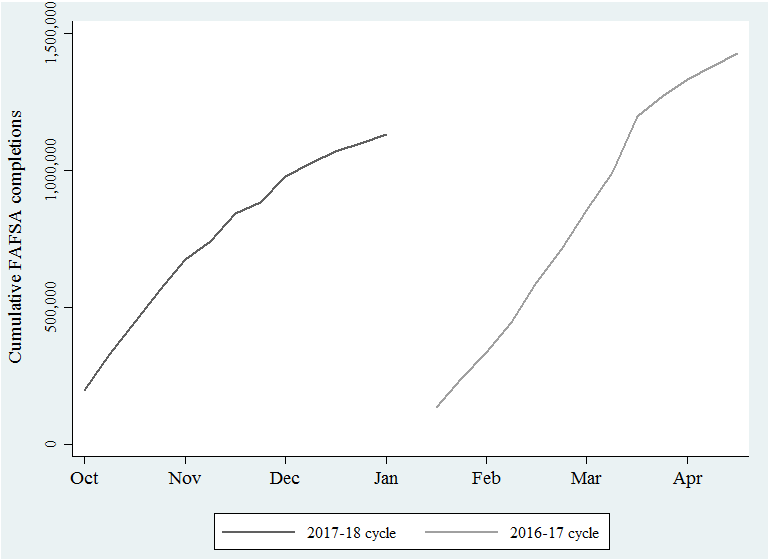
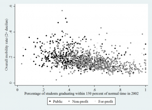
We can look at the correlation between each college’s graduation rate (from Table 10)  and merge this with the mobility data (Table 2) and see another side of the story the authors tell in the paper: broad-access institutions (which often have low graduation rates) are those that have the highest upward mobility. Below uses the “up two income deciles” measure of mobility and only looks at four-year institutions, but the negative relationship is pretty clear — even if a college has a low graduation rate, they are correlated with having have high overall upward mobility rates.

grad_rate

I’m happy to share more about how I ran these descriptives, and of course please chime in or email me if you see that I’m overlooking something here. The data set is new and I’m still getting oriented. And in that process, I found it helpful to document some of the steps I took so other researchers interested in this data might be able to have a sounding board. Good luck and I’ll be looking forward to seeing how this data is used, interpreted, and otherwise dealt with in the future. It will take a bit of community learning in order to get up to speed on what we can and can’t do with this new treasure or truly remarkable data.

Week 14 in the FAFSA cycle

The new FAFSA timeline added 14 weeks to the filing cycle. Instead of filing on January 1, students could file as early as October 1. As shown below, about 1.13 million high school seniors took advantage of the earlier and easier form:

Week 14 trend - dates

We are still about 300,000 behind “Week 14” of last year’s cycle. But “Week 14” used to be in April, so we have plenty of time to catch up. The old cycle was pretty condensed and the new cycle is elongated: the gray line should soon flatten out and the black line will catch (and hopefully surpass) it. We’ll keep monitoring to see when that moment occurs.

Data:

Week 2016-17 2017-18
2 135,387 196,736
3 239,605 328,607
4 334,837 448,958
5 444,951 563,560
6 591,914 672,694
7 711,858 740,843
8 852,752 842,620
9 990,403 882,778
10 1,198,080 976,563
11 1,269,537 1,023,711
12 1,332,608 1,067,470
13 1,380,565 1,099,324
14 1,425,995 1,130,204

High school FAFSA filing update: Week 14

Week 14 is a significant milestone in the new FAFSA timeline because that’s the number of weeks early FAFSA added to the 2017-18 filing cycle. We’ve been keeping track of the weekly total number of forms submitted and completed, shown below.

Week 14 trend

The “week is cycle” approach is a little tricky to interpret since Week 1 of each cycle starts at different times of the calendar year. This chart tells us between Oct 1 and Dec 30, 2016, about 1.13 million high school seniors (18 or younger) filed for the first time. The number was about 1.43 million for last year’s cycle, which ran from Jan 1 to April 1, 2016.

Last year, the weekly growth in FAFSA completions started to slow down around April. We still have about 10 weeks to go until then, so we anticipate the gaps in the two lines (about 300,000 students, or 26%) should start to close and eventually the black line will cross back over the gray. But if that doesn’t happen, or if we end up where we were last year in terms of overall completion, then I will be curious to see what folks point to as the underlying reason(s). And I’ll be even more curious if the elongated filing cycle brought with it any unintended consequences, like reducing the amount of state aid late-cycle filers receive.

FAFSA completion by state and week:

2 3 4 5 6 7 8 9 10 11 12 13 14
AK 154 320 446 612 764 873 1,064 1,126 1,286 1,352 1,436 1,478 1,524
AL 1,611 3,054 4,555 5,810 7,159 8,068 9,249 9,677 10,956 11,582 12,127 12,426 12,716
AR 1,377 2,567 3,726 4,738 5,743 6,395 7,368 7,685 8,383 8,811 9,143 9,393 9,639
AZ 4,143 6,061 7,914 9,734 11,405 12,508 14,398 15,009 16,068 16,832 17,543 18,034 18,742
CA 17,987 32,495 46,924 60,863 73,850 82,765 95,905 100,917 113,508 119,063 124,161 127,823 131,153
CO 2,991 5,466 7,766 9,703 11,551 12,638 14,427 14,951 16,303 16,910 17,473 17,873 18,323
CT 2,351 4,227 5,896 7,879 9,766 10,806 12,429 13,090 14,442 15,136 15,780 16,332 16,857
DC 234 421 572 738 926 1,045 1,237 1,310 1,496 1,585 1,670 1,746 1,804
DE 416 785 1,123 1,452 1,841 2,072 2,449 2,606 2,882 3,070 3,232 3,343 3,460
FL 11,419 17,703 23,769 28,665 33,335 36,247 40,033 41,657 45,760 48,037 50,730 51,993 53,227
GA 3,056 5,701 8,000 10,268 12,438 13,992 16,337 17,269 19,358 20,613 21,816 22,703 23,718
HI 1,162 1,787 2,342 2,841 3,276 3,533 3,905 4,087 4,407 4,593 4,787 4,932 5,064
IA 1,634 3,094 4,331 5,580 6,710 7,646 8,975 9,712 11,672 12,195 12,587 12,894 13,179
ID 562 1,128 1,741 2,463 3,190 3,594 4,259 4,449 5,204 5,443 5,636 5,759 5,895
IL 23,489 34,065 42,338 49,007 54,998 57,738 61,774 63,228 66,707 68,223 69,645 72,491 73,460
IN 2,684 4,879 7,061 9,250 11,509 12,751 15,012 15,841 17,701 18,651 19,411 19,979 20,736
KS 1,694 2,877 3,956 5,175 6,231 6,876 7,690 8,016 8,790 9,145 9,420 9,606 9,841
KY 9,186 12,388 14,689 16,386 17,654 18,342 19,277 19,688 20,611 21,078 21,499 21,711 21,910
LA 1,456 2,829 4,132 5,312 6,535 7,428 8,667 9,048 9,957 10,610 11,219 11,550 11,931
MA 2,995 6,003 8,763 12,027 15,643 17,903 21,119 22,251 24,700 26,005 27,268 28,367 29,443
MD 3,595 6,108 8,329 10,415 12,536 13,801 15,609 16,347 17,905 18,733 19,659 20,267 21,000
ME 1,111 1,941 2,693 3,340 3,944 4,312 4,806 4,970 5,308 5,501 5,694 5,836 5,941
MI 6,033 10,376 14,731 19,198 23,179 25,449 28,477 29,909 33,034 34,547 35,764 36,641 37,570
MN 2,302 4,232 6,032 8,344 10,429 11,721 13,636 14,595 16,635 17,505 18,322 18,908 19,642
MO 3,553 6,177 8,573 10,833 12,951 14,235 16,338 17,059 18,831 19,694 20,461 20,977 21,516
MS 717 1,521 2,413 3,233 3,871 4,499 5,351 5,636 6,392 6,875 7,382 7,587 7,779
MT 291 662 949 1,292 1,780 2,075 2,548 2,717 3,443 3,564 3,652 3,691 3,736
NC 5,452 9,189 12,307 15,103 18,120 19,933 22,953 24,269 26,853 28,155 29,297 30,151 31,084
ND 108 209 324 467 608 701 824 896 1,066 1,165 1,241 1,297 1,370
NE 1,119 2,071 2,990 3,858 4,672 5,314 6,090 6,463 7,107 7,502 7,835 8,085 8,312
NH 533 1,058 1,512 2,039 2,613 3,015 3,556 3,750 4,177 4,427 4,683 4,867 5,041
NJ 4,875 8,957 12,808 16,693 20,837 23,361 27,646 29,477 34,024 35,722 37,390 38,654 39,879
NM 595 1,126 1,743 2,328 2,842 3,208 3,806 4,030 4,533 4,791 5,012 5,131 5,283
NV 2,587 3,676 4,542 5,319 6,256 6,653 7,178 7,335 7,790 8,054 8,278 8,440 8,579
NY 8,152 15,264 22,293 30,150 37,996 43,111 51,361 54,919 61,595 65,697 69,653 72,782 75,545
OH 6,320 11,462 16,247 20,779 25,197 27,933 32,022 33,919 39,110 40,844 42,290 43,241 44,304
OK 2,377 3,989 5,335 6,557 7,755 8,358 9,174 9,477 10,212 10,651 11,139 11,339 11,584
OR 5,327 7,491 9,346 10,884 12,267 13,064 14,088 14,475 15,287 15,745 16,133 16,326 16,572
PA 6,098 11,082 15,412 19,755 24,102 26,863 31,075 32,865 36,120 38,293 40,208 41,680 43,366
RI 344 690 998 1,323 1,683 1,912 2,337 2,500 2,844 3,084 3,300 3,454 3,605
SC 1,844 3,108 4,437 5,726 6,944 7,720 8,783 9,198 10,315 10,913 11,462 11,809 12,207
SD 174 425 615 804 1,000 1,134 1,320 1,440 1,660 1,774 1,867 1,954 2,085
TN 8,765 12,746 16,642 20,089 23,132 24,692 26,780 27,564 29,369 30,999 32,686 33,529 34,412
TX 19,353 32,086 43,102 52,796 60,926 66,364 74,612 77,268 84,555 88,291 91,565 93,687 95,749
UT 707 1,316 1,985 2,712 3,524 4,192 5,291 5,698 6,887 7,305 7,606 7,781 8,030
VA 3,820 6,963 9,625 12,469 15,031 16,678 19,325 20,414 22,734 24,049 25,412 26,317 27,390
VT 242 537 838 1,188 1,554 1,673 1,883 1,938 2,101 2,178 2,268 2,336 2,421
WA 6,011 9,283 12,183 14,686 16,940 18,198 20,026 20,755 22,529 23,379 24,091 24,587 25,118
WI 2,985 5,327 7,431 9,449 11,521 12,963 14,910 15,813 17,990 19,058 19,945 20,711 21,446
WV 572 1,249 1,825 2,370 2,948 3,349 3,916 4,075 4,427 4,668 4,926 5,117 5,265
WY 173 436 654 858 1,012 1,142 1,325 1,390 1,539 1,614 1,666 1,709 1,751

Source: https://studentaid.ed.gov/sa/about/data-center/student/application-volume/fafsa-completion-high-school