Category Archives: Research

Party control in Congress and State Legislatures (1978-2016)

In the politics of education course I teach this semester, I was looking for a nice overview of trends in party control for Congress and state legislatures. Just a simple chart showing trends in which party holds the majority in the House and Senate and whether similar trends occur in state legislatures. We often just focus on one or the other, but I want to see Congress and states on the same graph.

But I couldn’t quite find what I was looking for. So in its absence (and in losing patience digging around), I compiled data from the Senate and House history pages along with the National Conference of State Legislatures partisan composition page.

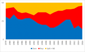
A few notes about what’s being measured here. For the states, NCSL tells us whether both chambers are controlled by a given party. If Democrats hold both chambers, then the state is coded as “Democrat.” States are coded as “Split” if Democrats carry one chamber and Republicans the other. Nebraska is omitted because it has a non-partisan unicameral legislature, but I put them in the “Split plus NE” category just so we have all 50 states. And all data are as of January of the given year, except 2016, which uses December to reflect the outcomes of the most recent election:

In this time frame, Democrats held party control in state legislatures until the early 1990s. At that time, states were becoming more split and slowly more Republican-controlled until Democrats gained a short-lived advantage around 2006. This results in an inverse portrait where 31 states were controlled by Democrats in 1978 and, fast-forwarding to the post-2016 election, 32 states are now controlled by Republicans.

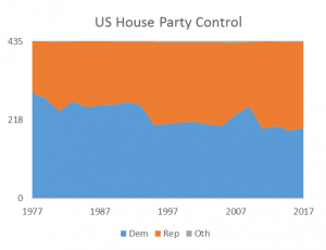
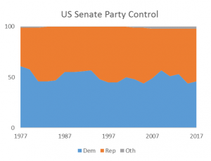
Shifting gears to Congress, the chart shows the percentage of members from each of the two parties:

In the Senate during this period, Democrats went from a high of 58 of seats in 1978 down to 46 in the current (115th) Congress. In the House, we see similar trends where Democrats held 64% of seats in 1978 and this has slowly dropped to about 45% today (194 D to 241 R).

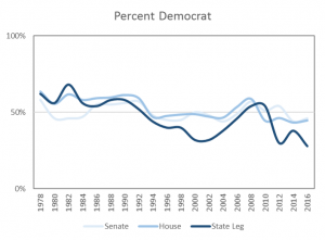
But these three charts are hard to put the full picture together, so the following combines them into a single visualization that I think tells the story a little clearer:

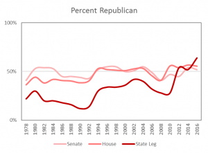
This chart shows three lines: the two light blue lines show the percent of Senate and House seats held by Democrats, the dark blue is the share of state with Democratic party control. Same goes for Republicans:

For a brief period in the early 1980s, Democrats held majorities in the House and Senate while also having party control of the majority of state legislatures. This is now the situation for Republicans, who have picked up state legislative party control and have gained majorities in Congress since 2010-2012.

These trends aren’t really surprising since we know Republicans have control of legislative chambers both in the states and in Congress. But how this has changed over time, the magnitude of growth, and overlaying these trends onto the same graph is something new to me. This helps me frame our class discussions around the broader political, social, demographic, and economic mechanisms driving these changes. I am no political scientist, so I can’t get too deep in the weeds, but this can help me frame some of our discussions around the broader partisan context in which higher education policy is being made.

Sources: Senate: https://www.senate.gov/history/partydiv.htm, House: http://history.house.gov/Institution/Party-Divisions/74-Present/, NCSL: http://www.ncsl.org/research/about-state-legislatures/partisan-composition.aspx

Data:

Senate House State Legislatures
Dem Rep Oth Dem Rep Oth Dem Rep Split+NE
1978 58 41 1 277 158 0 31 11 8
1980 46 53 1 242 192 1 28 15 7
1982 46 54 0 269 166 0 34 10 6
1984 47 53 0 253 182 0 28 10 12
1986 55 45 0 258 177 0 27 9 14
1988 55 45 0 260 175 0 29 8 13
1990 56 44 0 267 167 1 29 6 15
1992 57 43 0 258 176 1 26 7 17
1994 48 52 0 204 230 1 22 15 13
1996 45 55 0 207 226 2 20 17 13
1998 45 55 0 211 223 1 20 17 13
2000 50 50 0 212 221 2 16 18 16
2002 48 51 1 205 229 1 16 21 13
2004 44 55 1 202 231 2 19 20 11
2006 49 49 2 233 198 4 23 16 11
2008 57 41 2 256 178 1 27 14 9
2010 51 47 2 193 242 0 27 14 9
2012 54 45 1 201 234 0 15 27 8
2014 44 54 2 188 246 1 19 26 5
2016 46 52 2 194 241 0 14 32 4

FAFSA filing update – Wisconsin and Tennessee

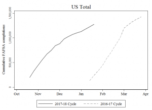
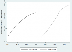
We are now 17 weeks into the 2017-18 FAFSA Cycle and about 1.27 million high school seniors have completed the form, according to FSA’s data.

Below is a chart comparing this cycle to last year’s (which began on Jan 1). We are far above where we were last January and about 150,000 behind where we were in April, when most states’ filing deadlines have passed.  The solid black line will continue to slope upward, and when April comes we will be able to make a better comparison between the two cycles.

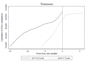
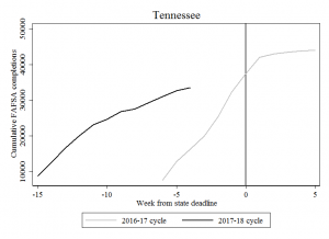
But in some states, we can already start to make preliminary comparisons since their filing deadlines have already passed. In Tennessee, for example, Jan 17 was the deadline for the Tennessee Promise program and we now have data that spans this deadline for both cycles (last year’s deadline was in February, so this chart shows “weeks from deadline” instead of calendar weeks).

In the current cycle, we see a sharper spike in the weeks leading up to the deadline, whereas last cycle was not quite as pronounced. Last year, the deadline was followed by a plateau, so we will be monitoring other states with deadlines to see whether similar patterns hold.

Regardless, nearly 50,000 Tennessee high school seniors filed the FAFSA this cycle compared to the nearly 38,000 who filed prior to last year’s deadline. This 12,000 differential is a large bump and likely due to a number of factors including greater awareness of the Tennessee Promise program, outreach efforts, the number of high school seniors, FAFSA changes, etc. We are unable to say with this data, but it sure is a promising trend to see!

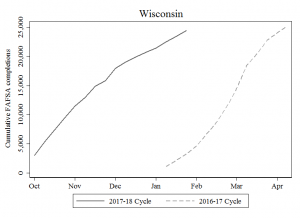
But several states do not have filing deadlines and instead use a first-come, first-serve basis for awarding financial aid. Wisconsin is one example and, unlike Tennessee, we do not see a surge in filing. Instead, we see more of a parallel filing trend that slowly converges.

Here 17 weeks into the current cycle, we have about the same number of filers as we saw last April (Week 14 of that cycle). In states without filing deadlines, we might expect to see flatter growth but we are unsure if this will plateau or steadily slow its growth rate until the FAFSA cycle ends.

We are thinking through the consequences of using hard (TN) versus soft (WI) filing deadlines and will eventually be able to see whether overall filing rates differ by state policy design. Maybe the won’t vary, but it’s worth a look!

For example, it seems possible a hard-deadline state should have higher overall filing rates since students may be more aware of the “use it or lose it” consequences of missing the deadline. But it is also possible hard-deadline states end up with lower overall filing rates for the exact same reason — students who miss the deadline may be out of luck and missing out will result in lower overall filing rates. We don’t know yet, and maybe we don’t detect any patterns, but this project is one step in that direction to dig into new areas of financial aid research.

Data:

week 17 summary.xlsx

Getting oriented to the new college mobility data

I have been digging into the new income mobility paper, just trying to wrap my head the details while not losing the forest for the trees. This is a remarkable study and the authors provide institution-level public data files here. There are 11 different files, so it takes some time getting familiar with their layout and to see which ones they used in the Upshot.

This post hopefully helps other folks navigate the data or offer me some insights into what you’ve found as you work through it. But here goes, I’ll replicate findings for Washington University in St. Louis and for California State University since these two got a lot of attention in the NYT article.

Replicating family income

According to Wash U’s Upshot page, the median family income of students is $272,000 and 84% come from the top quintile of the income distribution. To show just how lopsided their enrollments are in terms of economic diversity, consider this: about 22% of their student body comes from the top 1% of the income distribution, while less than 1% come from the bottom 20%!

Table 5 is where to find this data. Wash U’s identification number is “2520” and the Upshot uses the 1991 birth cohort, so be sure to restrict the panel to those criteria. These variables measure median parental household income (par_median_age20), along with the fraction of students enrolled by income quintile (par_q5_age20 and par_q1_age20) and top 1% (par_top1pc_age20) according to where the student was enrolled at age 20:

washu_tab5

Replicating upward mobility rates

The Upshot also displays two different mobility rate metrics:

The first is “moving up two or more quintiles,” and about 9 in 100 students come from the bottom and end up at least two quintiles higher as adults (30-somethings).The Upshot calls this the overall mobility rate.

The second is the same rate used in the Chetty et al paper, which is “moved from the bottom to top income quintile.” About 1 in 100 students come from the bottom and end up at the top quintile of the income distribution.

If I had to choose one of these measures, I would prefer the first since upward mobility doesn’t always have to be a rags to riches story. Moving from the bottom 20% to the top 40% is still upward mobility and wouldn’t be captured in the second measure.

Table 2 is where to find this mobility rate data. The paper explains how mobility rate is calculated as the product of access (fraction of students from bottom income quintile) and success rate (fraction of such students who reach the top income quintile as adults).

In the data, it’s easy to get bottom-to-top mobility rates (mr_kq5_pq1) that are used in the paper. But if you want to measure overall mobility (the first definition above), then you need to jump through some hoops — unless I overlooked a variable that does this already. You have to calculate each of the six possible ways a child can jump up two income quintiles: they can go from the bottom to the top three, or from the second-lowest to the top two, or from the third-lowest to the top.
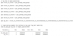
gen_uptwo

Between Tables 2 and 5, you can pretty easily replicate some of the main data elements of the Upshot page. It took a little bit of a learning curve to search across all these files and figure out which variable to use and when, but hopefully this brief discussion helps validate your efforts if you’re trying to use this data for research. And of course, if you see I missed something, please let me know!

Using this data for research

Now that we know how to extract two different mobility rates and the fraction of students from various income quintiles for each college, we might be inclined to use this data in our own research. There is still a lot to learn about this data and it will take time to fully understand the strengths, limitations, and opportunities this dataset provides researchers. It’s a massive amount of information generated from sources that haven’t been used to date. So researchers will have a learning curve and I know I’m still trying to make sense of what’s in here and how it might be used for research. Here are a few helpful things I’m still working through:

1) Parent-child relationships

Each student is connected to a college via the 1098-T tax form and NSLDS Pell Grant reports. Colleges must report tuition payments for all students using the 1098-T form, and if a student paid no tuition the NSLDS record picks them up. The tax form includes the employer ID number (EIN) corresponding to where the student paid tuition, creating a “near complete roster of college attendance at all Title IV institutions in the US,” which is remarkable.

However, this does not mean the college where the student enrolled is available in the dataset. In Table 11, Chetty et al begin with 5,903 institutions. About 2,960 of these colleges have “insufficient data” to report in the final analysis. Another 576 colleges end up getting clustered with at least one more institution.

For the University of Wisconsin, all 13 public four-year universities and UW Colleges (the system’s community colleges) are all lumped together as a single observation. Indiana University, University of Pittsburgh, University of Massachusetts, University of Maine, University of Maryland, University of Minnesota, University of South Carolina, West Virginia University, Miami-Dade Community College, the University of Tennessee, and several more colleges are in a similar boat as Wisconsin: the data does not reflect individual institutions. Considering the heterogeneity within systems, these system-level mobility rates will not reflect the mobility rate of each individual campus.

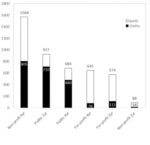
Here’s a better way to see it. Below is the total number of institutions (this time using unitid from IPEDS) by each sector. Two-year colleges include those that offer less-than two-year degrees. All are Title IV degree-granting institutions. Mapping Chetty et al’s data to this, we can see the data captures about 480 out of 684 (70%) public four-year universities but only half of non-profit (805 out of 1,568) and about 12% of for-profit four-year universities (78 of 645). Similar patterns occur in the two-year sector where about 77% of community/technical colleges are accounted for, but far lower rates in the private sectors:
ipeds_chetty

It is hard to tell the extent to which this matters, and maybe it doesn’t if we ascribe to the “some data is better than no data” argument (which I’m pretty sympathetic to in this case). But about 3.17 million students attend a collapsed institution, which is about 20% of the nation’s total enrollment. So given “University of Wisconsin System’s” bottom-to-top mobility rate of <1% and its overall mobility rate of 13%, I don’t know how to interpret this finding. Are the results driven by Madison’s campus? Milwaukee? Any of the others?

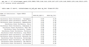
Let’s take the Cal State system as an example. Each campus is listed separately in the Chetty database and their mobility rates (bottom-to-top and overall) are below:
csu_opeid

We can see here the range of overall upward mobility (the right column) ranges from a low is 14% at CSU-Channel Islands to a high of 47% at CSU-Los Angeles. This is quite a bit of variation within a single system. If I lump these 15 universities together into “Cal State System” then our overall upward mobility score would be 26%, which doesn’t represent either campus’ experience very well:

csu_system

All of this is to say: be cautious working with parent-child relationships and realize this study only looks at about half of all colleges in the U.S. (depending on how we classify them).

2) Transfer and enrollment

The research team had to make some tough decisions about how to link students to their college. With nearly 40% of freshmen transferring within six years, should a student be matched to their original institution, the one they attended most often, the one they last enrolled in, or the one they earned a degree from? The paper and data files focus on the most-often attended college and the college last-attended at age 20 (they don’t give a lot of details, so you really have to read between the lines with some of this).

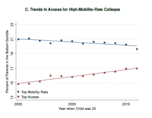
It is unclear whether or why one institution should be credited for upward mobility if their students attended multiple colleges. It is also unclear what mechanisms are at play when a student experiences upward mobility simply by attending (not completing) a college. Yet, that’s exactly what this study concludes — simply enrolling yields upward mobility. I don’t know how to make sense of this quite yet, but I found Figure IXC to be provocative. Despite the upward mobility gains documented throughout the paper, this figure shows how fewer low-income students are enrolling in high-mobility-rate colleges. The downward-sloping line shows how access is slowly (and shallowly) falling at the colleges that seem to be doing the best in terms of advancing opportunity. Again, I haven’t wrapped my head fully around this, but it’s certainly stuck in my head when thinking about where this trend is heading:
fig_ix

3) Graduation rates

The paper and data files do not address or measure degree attainment. All the mobility gains discussed in the NYT and elsewhere are associated with attending, not completing, college.

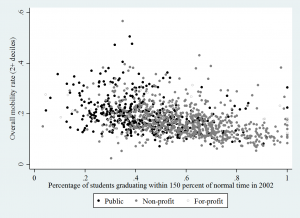
We can look at the correlation between each college’s graduation rate (from Table 10)  and merge this with the mobility data (Table 2) and see another side of the story the authors tell in the paper: broad-access institutions (which often have low graduation rates) are those that have the highest upward mobility. Below uses the “up two income deciles” measure of mobility and only looks at four-year institutions, but the negative relationship is pretty clear — even if a college has a low graduation rate, they are correlated with having have high overall upward mobility rates.
grad_rate

I’m happy to share more about how I ran these descriptives, and of course please chime in or email me if you see that I’m overlooking something here. The data set is new and I’m still getting oriented. And in that process, I found it helpful to document some of the steps I took so other researchers interested in this data might be able to have a sounding board. Good luck and I’ll be looking forward to seeing how this data is used, interpreted, and otherwise dealt with in the future. It will take a bit of community learning in order to get up to speed on what we can and can’t do with this new treasure or truly remarkable data.
Week 14 in the FAFSA cycle

The new FAFSA timeline added 14 weeks to the filing cycle. Instead of filing on January 1, students could file as early as October 1. As shown below, about 1.13 million high school seniors took advantage of the earlier and easier form:

Week 14 trend - dates

We are still about 300,000 behind “Week 14” of last year’s cycle. But “Week 14” used to be in April, so we have plenty of time to catch up. The old cycle was pretty condensed and the new cycle is elongated: the gray line should soon flatten out and the black line will catch (and hopefully surpass) it. We’ll keep monitoring to see when that moment occurs.

Data:

Week 2016-17 2017-18
2 135,387 196,736
3 239,605 328,607
4 334,837 448,958
5 444,951 563,560
6 591,914 672,694
7 711,858 740,843
8 852,752 842,620
9 990,403 882,778
10 1,198,080 976,563
11 1,269,537 1,023,711
12 1,332,608 1,067,470
13 1,380,565 1,099,324
14 1,425,995 1,130,204

High school FAFSA filing update: Week 14

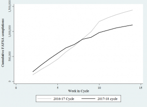
Week 14 is a significant milestone in the new FAFSA timeline because that’s the number of weeks early FAFSA added to the 2017-18 filing cycle. We’ve been keeping track of the weekly total number of forms submitted and completed, shown below.

Week 14 trend

The “week is cycle” approach is a little tricky to interpret since Week 1 of each cycle starts at different times of the calendar year. This chart tells us between Oct 1 and Dec 30, 2016, about 1.13 million high school seniors (18 or younger) filed for the first time. The number was about 1.43 million for last year’s cycle, which ran from Jan 1 to April 1, 2016.

Last year, the weekly growth in FAFSA completions started to slow down around April. We still have about 10 weeks to go until then, so we anticipate the gaps in the two lines (about 300,000 students, or 26%) should start to close and eventually the black line will cross back over the gray. But if that doesn’t happen, or if we end up where we were last year in terms of overall completion, then I will be curious to see what folks point to as the underlying reason(s). And I’ll be even more curious if the elongated filing cycle brought with it any unintended consequences, like reducing the amount of state aid late-cycle filers receive.

FAFSA completion by state and week:

2 3 4 5 6 7 8 9 10 11 12 13 14
AK 154 320 446 612 764 873 1,064 1,126 1,286 1,352 1,436 1,478 1,524
AL 1,611 3,054 4,555 5,810 7,159 8,068 9,249 9,677 10,956 11,582 12,127 12,426 12,716
AR 1,377 2,567 3,726 4,738 5,743 6,395 7,368 7,685 8,383 8,811 9,143 9,393 9,639
AZ 4,143 6,061 7,914 9,734 11,405 12,508 14,398 15,009 16,068 16,832 17,543 18,034 18,742
CA 17,987 32,495 46,924 60,863 73,850 82,765 95,905 100,917 113,508 119,063 124,161 127,823 131,153
CO 2,991 5,466 7,766 9,703 11,551 12,638 14,427 14,951 16,303 16,910 17,473 17,873 18,323
CT 2,351 4,227 5,896 7,879 9,766 10,806 12,429 13,090 14,442 15,136 15,780 16,332 16,857
DC 234 421 572 738 926 1,045 1,237 1,310 1,496 1,585 1,670 1,746 1,804
DE 416 785 1,123 1,452 1,841 2,072 2,449 2,606 2,882 3,070 3,232 3,343 3,460
FL 11,419 17,703 23,769 28,665 33,335 36,247 40,033 41,657 45,760 48,037 50,730 51,993 53,227
GA 3,056 5,701 8,000 10,268 12,438 13,992 16,337 17,269 19,358 20,613 21,816 22,703 23,718
HI 1,162 1,787 2,342 2,841 3,276 3,533 3,905 4,087 4,407 4,593 4,787 4,932 5,064
IA 1,634 3,094 4,331 5,580 6,710 7,646 8,975 9,712 11,672 12,195 12,587 12,894 13,179
ID 562 1,128 1,741 2,463 3,190 3,594 4,259 4,449 5,204 5,443 5,636 5,759 5,895
IL 23,489 34,065 42,338 49,007 54,998 57,738 61,774 63,228 66,707 68,223 69,645 72,491 73,460
IN 2,684 4,879 7,061 9,250 11,509 12,751 15,012 15,841 17,701 18,651 19,411 19,979 20,736
KS 1,694 2,877 3,956 5,175 6,231 6,876 7,690 8,016 8,790 9,145 9,420 9,606 9,841
KY 9,186 12,388 14,689 16,386 17,654 18,342 19,277 19,688 20,611 21,078 21,499 21,711 21,910
LA 1,456 2,829 4,132 5,312 6,535 7,428 8,667 9,048 9,957 10,610 11,219 11,550 11,931
MA 2,995 6,003 8,763 12,027 15,643 17,903 21,119 22,251 24,700 26,005 27,268 28,367 29,443
MD 3,595 6,108 8,329 10,415 12,536 13,801 15,609 16,347 17,905 18,733 19,659 20,267 21,000
ME 1,111 1,941 2,693 3,340 3,944 4,312 4,806 4,970 5,308 5,501 5,694 5,836 5,941
MI 6,033 10,376 14,731 19,198 23,179 25,449 28,477 29,909 33,034 34,547 35,764 36,641 37,570
MN 2,302 4,232 6,032 8,344 10,429 11,721 13,636 14,595 16,635 17,505 18,322 18,908 19,642
MO 3,553 6,177 8,573 10,833 12,951 14,235 16,338 17,059 18,831 19,694 20,461 20,977 21,516
MS 717 1,521 2,413 3,233 3,871 4,499 5,351 5,636 6,392 6,875 7,382 7,587 7,779
MT 291 662 949 1,292 1,780 2,075 2,548 2,717 3,443 3,564 3,652 3,691 3,736
NC 5,452 9,189 12,307 15,103 18,120 19,933 22,953 24,269 26,853 28,155 29,297 30,151 31,084
ND 108 209 324 467 608 701 824 896 1,066 1,165 1,241 1,297 1,370
NE 1,119 2,071 2,990 3,858 4,672 5,314 6,090 6,463 7,107 7,502 7,835 8,085 8,312
NH 533 1,058 1,512 2,039 2,613 3,015 3,556 3,750 4,177 4,427 4,683 4,867 5,041
NJ 4,875 8,957 12,808 16,693 20,837 23,361 27,646 29,477 34,024 35,722 37,390 38,654 39,879
NM 595 1,126 1,743 2,328 2,842 3,208 3,806 4,030 4,533 4,791 5,012 5,131 5,283
NV 2,587 3,676 4,542 5,319 6,256 6,653 7,178 7,335 7,790 8,054 8,278 8,440 8,579
NY 8,152 15,264 22,293 30,150 37,996 43,111 51,361 54,919 61,595 65,697 69,653 72,782 75,545
OH 6,320 11,462 16,247 20,779 25,197 27,933 32,022 33,919 39,110 40,844 42,290 43,241 44,304
OK 2,377 3,989 5,335 6,557 7,755 8,358 9,174 9,477 10,212 10,651 11,139 11,339 11,584
OR 5,327 7,491 9,346 10,884 12,267 13,064 14,088 14,475 15,287 15,745 16,133 16,326 16,572
PA 6,098 11,082 15,412 19,755 24,102 26,863 31,075 32,865 36,120 38,293 40,208 41,680 43,366
RI 344 690 998 1,323 1,683 1,912 2,337 2,500 2,844 3,084 3,300 3,454 3,605
SC 1,844 3,108 4,437 5,726 6,944 7,720 8,783 9,198 10,315 10,913 11,462 11,809 12,207
SD 174 425 615 804 1,000 1,134 1,320 1,440 1,660 1,774 1,867 1,954 2,085
TN 8,765 12,746 16,642 20,089 23,132 24,692 26,780 27,564 29,369 30,999 32,686 33,529 34,412
TX 19,353 32,086 43,102 52,796 60,926 66,364 74,612 77,268 84,555 88,291 91,565 93,687 95,749
UT 707 1,316 1,985 2,712 3,524 4,192 5,291 5,698 6,887 7,305 7,606 7,781 8,030
VA 3,820 6,963 9,625 12,469 15,031 16,678 19,325 20,414 22,734 24,049 25,412 26,317 27,390
VT 242 537 838 1,188 1,554 1,673 1,883 1,938 2,101 2,178 2,268 2,336 2,421
WA 6,011 9,283 12,183 14,686 16,940 18,198 20,026 20,755 22,529 23,379 24,091 24,587 25,118
WI 2,985 5,327 7,431 9,449 11,521 12,963 14,910 15,813 17,990 19,058 19,945 20,711 21,446
WV 572 1,249 1,825 2,370 2,948 3,349 3,916 4,075 4,427 4,668 4,926 5,117 5,265
WY 173 436 654 858 1,012 1,142 1,325 1,390 1,539 1,614 1,666 1,709 1,751

Source: https://studentaid.ed.gov/sa/about/data-center/student/application-volume/fafsa-completion-high-school

Distribution of PBF funds in Missouri

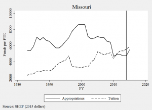
In anti-tax states like Missouri, it’s a hard political bargain to just give universities new money. Legislators, particularly those on the right, ask “what did colleges do to earn it?” Perhaps the only politically feasible way to get new money for Missouri public higher education is to play the performance funding game. The chart below suggests this may be the case:

mo_shef

The vertical line is when the state’s new PBF system began. And it is precisely the same year we see the first large uptick in funding since the early 1990s. As it turns out, Missouri operated an old version of PBF from 1993 to 2002, which corresponds with the largest growth period on this 40-year chart.

There are several plausible explanations behind these correlations, but this context helps me think about an alternative goal of performance funding: providing political cover for justifying public investment. I have heard this logic in Wisconsin, which is considering reinvesting $42.5 million in the UW-System. Legislators say they can’t go back to their district and tell constituents, “we just gave universities more money.” Instead, it plays a lot better politically to say, “we reinvested because universities showed us they earned it.” The politics of resentment and the strategic dismantling of public institutions is alive and well in Wisconsin, so performance funding is a convenient political tool for justifying reinvestment.

Tying just a small share of a budget to performance measures may give enough political cover to build a broad coalition of support, even if few funds are actually based on performance. In Missouri, about 3% of funds flow through its performance funding model and advocates would like to see that raised to at least 25%. So let’s look at which Missouri universities benefit from this new era of finance.

A recent audit report provides data we rarely see from PBF states by documenting how much money each institution has received from PBF over time. Since 2014, the state has appropriated a total of $109 million through the model and all four-year universities have received budget increases. We could stop there and say, “everybody’s a winner, so there’s nothing to see here.” But we need to look a bit closer if we’re at all concerned about an equitable funding model for higher education.

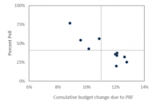
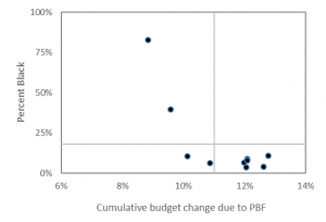
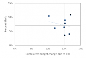
The charts below merge Missouri’s audit data with IPEDS to show overall budgetary gains due to PBF (x-axis)  according to the percent of students receiving Pell and the percent of students who are Black (y-axis).

mo_pell

The chart above shows how campuses receiving the largest budgetary gains are those enrolling the smallest share of Pell Grant students. Harris-Stowe State University and Lincoln University, the state’s two public HBCUs, are in the upper-left corner of this chart. They enroll the highest share of Pell Grant recipients, yet they have received the smallest budgetary boost from the new funding model. They did gain money, but not as much as other institutions in the state.

The chart below shifts attention to the share of Black students and finds a similar negative relationship, where colleges enrolling the highest share of Black students tend to have the smallest budgetary growth. Harris-Stowe and Lincoln University are again the two dots in the upper-left quadrant.

mo_black1

These two campuses enroll about 3% of the state’s total student population, but nearly 20% of the state’s entire Black undergraduate population in the public four-year sector. In a similar back-of-the-envelope analysis, I found nearly identical patterns in Tennessee.

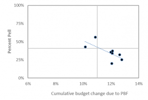
Some might look at these charts and say HBCUs are outliers. If you just removed them from the analysis, then these relationships wouldn’t exist. But that argument misses the entire point and, aside from the dog-whistle politics it evokes, is precisely what we should care most about. Just for the sake of argument, I’ve dropped the “outliers” and replicated the charts below and find the same negative relationship.

mo_pell2mo_black2

There is a lot of work to be done with respect to understanding and explaining the causes of funding inequities in state higher education finance. Even more work is in store if we want to evaluate their consequences and discover new solutions to age-old problems in higher education finance. This will be hard to do when political expedience is the preferred strategy guiding state higher education finance policy. This approach may very well do more to reinforce rather than reverse inequality.

Data:

Total enrollment Budget change from PF Black enrollment Pell enrollment Percent Black Percent Pell
Harris-Stowe 1,280 9% 1,058 981 83% 77%
Lincoln University 2,977 10% 1,179 1,617 40% 54%
Missouri Southern 5,561 11% 341 3,131 6% 56%
Missouri State 18,517 13% 742 5,931 4% 32%
Missouri Western 5,650 10% 590 2,413 10% 43%
Northwest Missouri 5,491 12% 356 1,960 6% 36%
Southeast Missouri 10,848 12% 973 3,698 9% 34%
Truman State 5,910 12% 212 1,187 4% 20%
Central Missouri 9,838 12% 771 3,654 8% 37%
U of Missouri System 51,969 13% 5,659 13,013 11% 25%
  U of Missouri-Columbia 27,642 n/a 2,268 5,756 8% 21%
  U of Missouri-Kansas City 10,453 n/a 1,376 3,285 13% 31%
  U of Missouri-St Louis 13,874 n/a 2,015 3,972 15% 29%

Dealing with FAFSA weeks

There are two ways to track FAFSA completions: week-in-cycle or week-on-calendar. The good folks at the US Department of Education report both, so it’s up to the researcher to decide how best to use this data. Each approach has merits and below are a couple of examples that show why.

The “week-in-cycle” approach seems preferable when states do not have hard filing deadlines. This is because these states use a first-come first-serve approach, where funds are available until they run out. October 1 marked the first day funds were available for the current cycle and January 1 for last cycle. This means “Week 1” is when the state rings the bell to start the financial aid race.

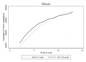
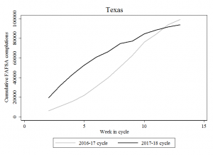
The figure below shows how this plays out in IL and TX. Here we compare last year’s and this year’s cycles and can see nearly identical patterns: there was a nice boost in the first several weeks, but this boost cools down around Weeks 10 or 11. In these states (which have two of the nation’s largest aid programs) we are seeing fewer completed FAFSAs this year:

IL_week_in_cycleTX_week_in_cycle

The “week-on-calendar” approach seems best to use in states that have hard filing deadlines. Missing this deadline means missing out on aid. This matters when comparing trends in the two filing cycles because “Week 13” corresponds with different calendar dates: March 25, 2016, versus December 23, 2017. If I am in a state with a March deadline (as many have) then I want to see how many people have filed relative to that deadline.

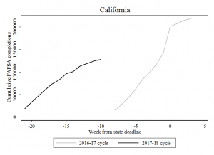
California and Tennessee are good examples. California’s deadline is March 2nd and the Tennessee Promise’s deadline is January 17, so let’s set those deadlines at the value of zero below. The weeks on the x-axis tell us how many weeks we are out from the deadline:

CA_deadline_chartTN_deadline_chart

California is still several weeks out from its deadline, but Tennessee is only a few weeks away. In both states, FAFSA completions are below last year’s levels, but we should expect a bump in the weeks immediately prior to the deadline. Once those deadlines pass, we should expect to see things flatten out as the states’ main programs targeted to high school seniors close their books for the year.

The next trick is verifying the priority dates and deadlines for each state. The Office of Federal Student Aid provides a database here and NASFAA has one here, which will be handy as we analyze and share this data.


High school FAFSA filing trends

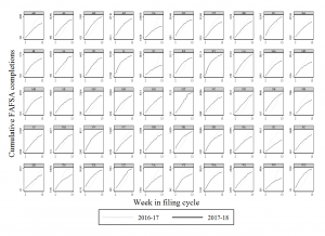
Every week, the U.S. Department of Education releases data on the number high school seniors who have submitted and completed the FAFSA form. Two UW doc students and I are downloading, archiving, and analyzing this data each week and below is a chart summarizing completions for each state and week of the current cycle (2017-18) and last year’s cycle (2016-17).

Week 13 lattice

Tracking completions by this “week-in-cycle” approach is a first step in monitoring progress and tracking the rhythms of the filing cycle. Notice how there is an early boost in several states, where completions are above last year’s levels. But then notice in most states how that boost seems to flatten out when compared to last year’s cycle.

Nationally, the number completions is down by about 20% from the same time in last year’s cycle. This could simply be because the two FAFSA cycles do not match up on the calendar: Week 13 of the current cycle spans from October 1st to December 23rd, 2016, while Week 13 of last year’s cycle spans from January 1st to March 25th.

For example, California’s deadline is March 2nd and it didn’t change from last year. Week 13 spanned that deadline last year, but not this year. As state filing deadlines pass, we will take a closer look at each one to see whether there is a bump in filing. We are looking closely at Tennessee since the TN Promise deadline is Jan 17 (Feb 15 last year).

Ultimately, we want to know whether earlier and easier filing increases overall FAFSA filing rates. We won’t be able to answer that definitively with our data, but we think we’re taking a step in the right direction.

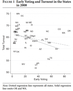
This is a similar public policy question asked by fellow UW faculty members, who were curious if early voting brings more voters to the polls. This is a complicated question to answer, but they found the short answer was “no” as shown below.

Capture

Surprisingly, early voting may actually depress overall voter turnout. However, when states have election-day registration or couple election-day registration with early voting, they see higher turnout. The authors’ conclusion has stuck with me and is occupying my attention, “election reform has goals other than increasing voter turnout, including minimizing cost and administrative burden…”

We don’t have to squint too hard to see the similarities between these two contexts: making a bureaucratic process easier and earlier does not necessarily increase overall participation. It very well may (and I hope/think it will) with the FAFSA. Drawing lessons from other areas of social science can help us think about higher education in new and creative ways. Doing so might also help us stumble upon new solutions to age-old problems.

If we find that overall filing rates didn’t tick up (or didn’t tick up as much as anticipated) then perhaps we need the equivalent of “election-day registration” for the FAFSA. I don’t even know what that might look like, but it’s something we might need to anticipate if the trends in the chart above don’t pick back up in March when many states’ deadlines are up.

Distribution of OBF funds in Tennessee

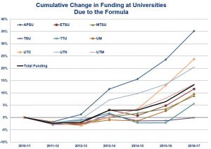
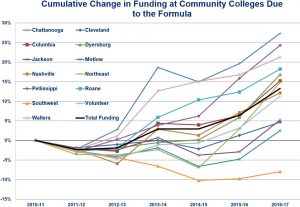
The following four charts highlight a critical and often overlooked consequence of Tennessee’s performance-based funding model. The first two are taken from the Tennessee Higher Education Commission’s recent report on the “cumulative change in funding due to the formula.” The left chart includes four-year universities; the right includes community colleges:

TN OBF TN OBF 2

All campuses started at zero in 2010-11 (when the new funding model was first adopted), and by 2016-17 we can see a handful of colleges emerge as winners and losers under the funding model. Austin Peay State University has benefited the most among four-year institutions: APSU funding has increased by 35% since the policy was adopted. In the community college sector, Chattanooga State Community College’s budget has grown by about 27%.

On the other hand, several colleges are hovering right around the 0% line, meaning the formula has not rewarded them with any financial benefits. Tennessee State University, the state’s only public HBCU, stands out as having not received any new money under the formula. This is despite being one of the few campuses experiencing steady enrollment growth during this same period, rising 5% while most other campuses (including APSU) enroll fewer students.

The two charts above include a solid black “total funding” line representing the state average. Four universities are above this line, but these four universities only enroll 6,165 Black undergraduates. The five universities below this line enroll 18,869. In other words, three in four Black undergraduates attend a college receiving the below-average budgetary growth under the state’s model. Exactly the same pattern holds in the chart on the right that looks at community colleges. We could look also look at Pell grant enrollments at these institutions and a similar pattern would persist.

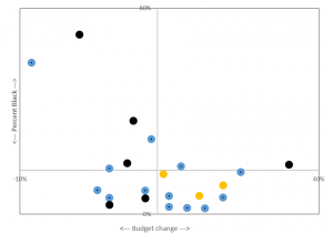
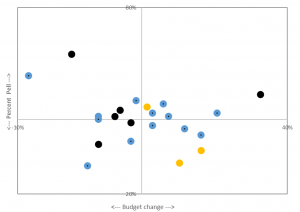
The two charts below look at this in a slightly different way. In these charts, the blue dots are community colleges (n=13), black dots are board of regents universities (n=6), and orange dots are campuses in the UT system (n=3). The horizontal line represents the cumulative budgetary change and vertical lines represent Black and Pell enrollment share.

chart1 chart2

Austin Peay State University is the black dot furthest to the right since it received the greatest budgetary gain. Tennessee State University and Southwest Tennessee Community College are the two left-most dots since they received the greatest budgetary loss. In both charts, we see a negative relationship between budgetary gains and enrolling traditionally under-served students. Less racially and socioeconomically inclusive colleges tend to receive more state support.

These are only back-of-the-envelope calculations using the Tennessee Higher Education Commission report and the most recent IPEDS data. More research is needed to understand the causes and consequences of these trends. But given what we know about college access and student success, and the role state subsidies play to those ends, it seems that Tennessee’s funding model may be poised to reinforce rather than reverse educational inequality.

Raw data:

Budget change Black enroll Pell enroll Total undergrad enrollment % Black % Pell
2010-11 2011-12 2012-13 2013-14 2014-15
1 APSU 4yr 35% 2077 5008 11343 11564 11381 11432 10782 19% 44%
2 Chatt. 2yr 27% 2065 4566 13549 13606 13530 13104 12661 16% 35%
3 Pellissippi 2yr 24% 941 4194 15585 15625 15015 15244 14494 6% 28%
4 UTC 4yr 24% 1255 3520 10106 10941 11197 11265 11232 11% 31%
5 Walters 2yr 21% 171 2550 9093 8744 8390 8010 7601 2% 32%
6 UTK 4yr 20% 1666 6366 23168 22963 22958 23202 23302 7% 27%
7 Roane 2yr 18% 184 2811 8900 8861 8505 8183 7765 2% 34%
8 Dyersburg 2yr 17% 671 1583 4753 4765 4613 4143 3627 19% 38%
9 Columbia 2yr 15% 486 2201 7537 7393 7229 7070 6933 7% 31%
10 Northeast 2yr 15% 206 2697 8785 8468 8427 7676 7556 3% 35%
11 UTM 4yr 14% 1167 3368 9118 8581 8311 7942 7471 16% 42%
12 Nashville 2yr 12% 4181 5021 14305 14329 14688 14573 14396 29% 34%
13 Volunteer 2yr 11% 970 3029 12351 11894 11503 11482 10725 9% 26%
14 ETSU 4yr 11% 812 5119 13752 14194 13960 13455 13196 6% 38%
15 UM 4yr 9% 7203 8057 20299 20650 20443 19939 19850 36% 40%
16 MTSU 4yr 8% 4743 9465 27196 26958 25850 24521 23955 20% 39%
17 Cleveland 2yr 5% 294 1681 4944 4986 4739 4830 4648 6% 35%
18 Jackson 2yr 5% 1169 2026 7412 6752 6172 6180 6616 18% 33%
19 TTU 4yr 5% 409 3640 10352 10940 11005 11252 11331 4% 32%
20 Motlow 2yr 3% 581 1411 6878 6689 6391 6434 6299 9% 22%
21 TSU 4yr 0% 5702 4409 7816 8231 7909 7869 8168 70% 56%
22 Southwest 2yr -8% 9023 6282 19989 19592 17949 16180 15335 59% 39%