The following four charts highlight a critical and often overlooked consequence of Tennessee’s performance-based funding model. The first two are taken from the Tennessee Higher Education Commission’s recent report on the “cumulative change in funding due to the formula.” The left chart includes four-year universities; the right includes community colleges:
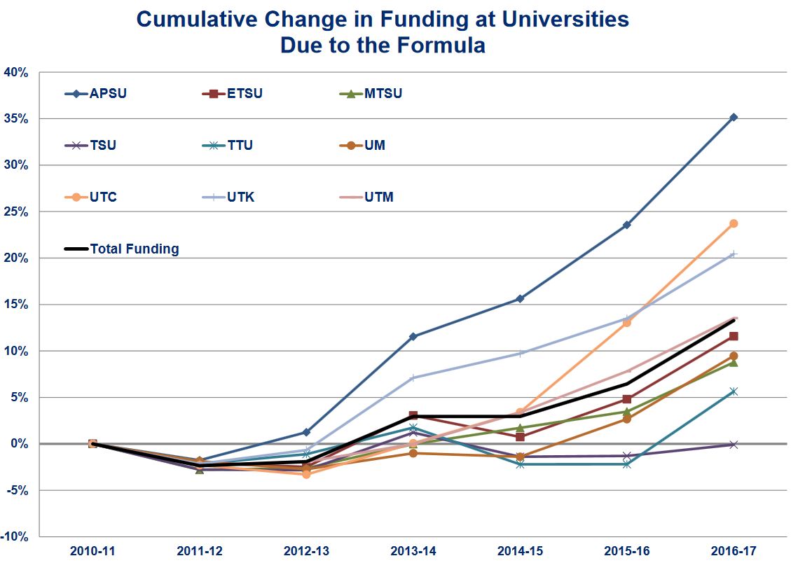
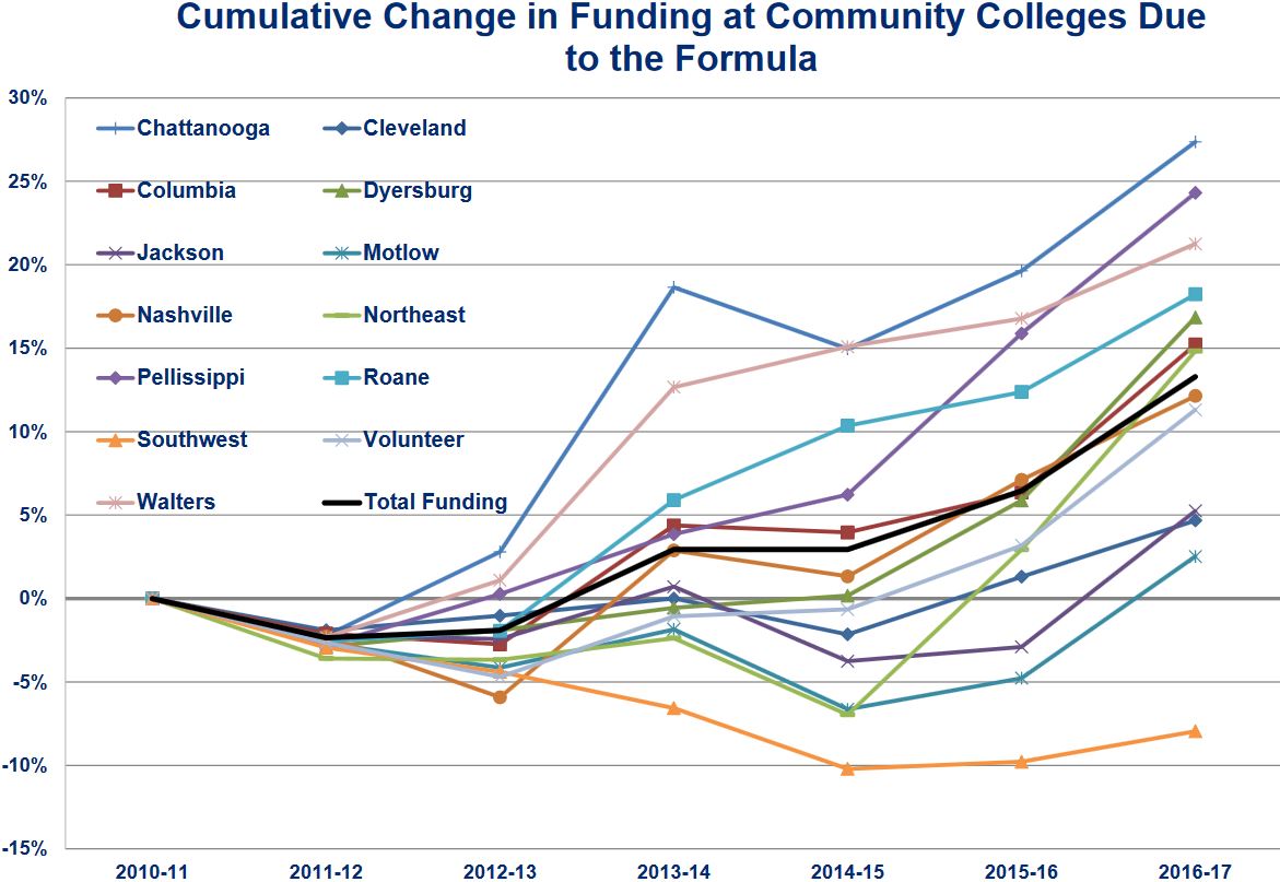
All campuses started at zero in 2010-11 (when the new funding model was first adopted), and by 2016-17 we can see a handful of colleges emerge as winners and losers under the funding model. Austin Peay State University has benefited the most among four-year institutions: APSU funding has increased by 35% since the policy was adopted. In the community college sector, Chattanooga State Community College’s budget has grown by about 27%.
On the other hand, several colleges are hovering right around the 0% line, meaning the formula has not rewarded them with any financial benefits. Tennessee State University, the state’s only public HBCU, stands out as having not received any new money under the formula. This is despite being one of the few campuses experiencing steady enrollment growth during this same period, rising 5% while most other campuses (including APSU) enroll fewer students.
The two charts above include a solid black “total funding” line representing the state average. Four universities are above this line, but these four universities only enroll 6,165 Black undergraduates. The five universities below this line enroll 18,869. In other words, three in four Black undergraduates attend a college receiving the below-average budgetary growth under the state’s model. Exactly the same pattern holds in the chart on the right that looks at community colleges. We could look also look at Pell grant enrollments at these institutions and a similar pattern would persist.
The two charts below look at this in a slightly different way. In these charts, the blue dots are community colleges (n=13), black dots are board of regents universities (n=6), and orange dots are campuses in the UT system (n=3). The horizontal line represents the cumulative budgetary change and vertical lines represent Black and Pell enrollment share.
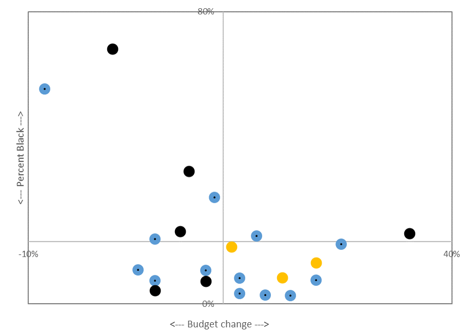
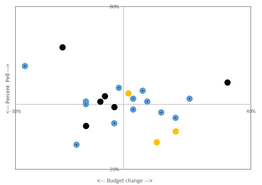
Austin Peay State University is the black dot furthest to the right since it received the greatest budgetary gain. Tennessee State University and Southwest Tennessee Community College are the two left-most dots since they received the greatest budgetary loss. In both charts, we see a negative relationship between budgetary gains and enrolling traditionally under-served students. Less racially and socioeconomically inclusive colleges tend to receive more state support.
These are only back-of-the-envelope calculations using the Tennessee Higher Education Commission report and the most recent IPEDS data. More research is needed to understand the causes and consequences of these trends. But given what we know about college access and student success, and the role state subsidies play to those ends, it seems that Tennessee’s funding model may be poised to reinforce rather than reverse educational inequality.
Raw data:
| Budget change | Black enroll | Pell enroll | Total undergrad enrollment | % Black | % Pell | |||||||
| 2010-11 | 2011-12 | 2012-13 | 2013-14 | 2014-15 | ||||||||
| 1 | APSU | 4yr | 35% | 2077 | 5008 | 11343 | 11564 | 11381 | 11432 | 10782 | 19% | 44% |
| 2 | Chatt. | 2yr | 27% | 2065 | 4566 | 13549 | 13606 | 13530 | 13104 | 12661 | 16% | 35% |
| 3 | Pellissippi | 2yr | 24% | 941 | 4194 | 15585 | 15625 | 15015 | 15244 | 14494 | 6% | 28% |
| 4 | UTC | 4yr | 24% | 1255 | 3520 | 10106 | 10941 | 11197 | 11265 | 11232 | 11% | 31% |
| 5 | Walters | 2yr | 21% | 171 | 2550 | 9093 | 8744 | 8390 | 8010 | 7601 | 2% | 32% |
| 6 | UTK | 4yr | 20% | 1666 | 6366 | 23168 | 22963 | 22958 | 23202 | 23302 | 7% | 27% |
| 7 | Roane | 2yr | 18% | 184 | 2811 | 8900 | 8861 | 8505 | 8183 | 7765 | 2% | 34% |
| 8 | Dyersburg | 2yr | 17% | 671 | 1583 | 4753 | 4765 | 4613 | 4143 | 3627 | 19% | 38% |
| 9 | Columbia | 2yr | 15% | 486 | 2201 | 7537 | 7393 | 7229 | 7070 | 6933 | 7% | 31% |
| 10 | Northeast | 2yr | 15% | 206 | 2697 | 8785 | 8468 | 8427 | 7676 | 7556 | 3% | 35% |
| 11 | UTM | 4yr | 14% | 1167 | 3368 | 9118 | 8581 | 8311 | 7942 | 7471 | 16% | 42% |
| 12 | Nashville | 2yr | 12% | 4181 | 5021 | 14305 | 14329 | 14688 | 14573 | 14396 | 29% | 34% |
| 13 | Volunteer | 2yr | 11% | 970 | 3029 | 12351 | 11894 | 11503 | 11482 | 10725 | 9% | 26% |
| 14 | ETSU | 4yr | 11% | 812 | 5119 | 13752 | 14194 | 13960 | 13455 | 13196 | 6% | 38% |
| 15 | UM | 4yr | 9% | 7203 | 8057 | 20299 | 20650 | 20443 | 19939 | 19850 | 36% | 40% |
| 16 | MTSU | 4yr | 8% | 4743 | 9465 | 27196 | 26958 | 25850 | 24521 | 23955 | 20% | 39% |
| 17 | Cleveland | 2yr | 5% | 294 | 1681 | 4944 | 4986 | 4739 | 4830 | 4648 | 6% | 35% |
| 18 | Jackson | 2yr | 5% | 1169 | 2026 | 7412 | 6752 | 6172 | 6180 | 6616 | 18% | 33% |
| 19 | TTU | 4yr | 5% | 409 | 3640 | 10352 | 10940 | 11005 | 11252 | 11331 | 4% | 32% |
| 20 | Motlow | 2yr | 3% | 581 | 1411 | 6878 | 6689 | 6391 | 6434 | 6299 | 9% | 22% |
| 21 | TSU | 4yr | 0% | 5702 | 4409 | 7816 | 8231 | 7909 | 7869 | 8168 | 70% | 56% |
| 22 | Southwest | 2yr | -8% | 9023 | 6282 | 19989 | 19592 | 17949 | 16180 | 15335 | 59% | 39% |
Hi Nick,
My colleagues and I at Research for Action have been studying outcomes-based funding in Tennessee for almost three years now and have recently completed a mixed-methods study of the state that includes both student- and institutional-level analyses. One component of our research examines whether OBF has a detrimental effect on underserved students – as we agree, this is an important issue that should be given attention.
Looking at your two scatterplots, it seems that the negative relationship between percent underserved students and percent funding change seems to be driven by two institutions – Tennessee State University and Southwest Tennessee Community College. If you take those two institutions out of the picture, there appears to actually be a positive relationship between percent of students who are Pell recipients and percent funding change. Of course, we shouldn’t ignore those two institutions, but what you’ve identified here is a story about those two institutions, not one of a widespread trend in outcomes-based funding.
I would argue that the main takeaway from your post is that Tennessee should consider awarding institutions additional funding when they graduate underrepresented minority students, as they already do with low-income students. Currently, Tennessee’s funding formula treats all low-income students the same, regardless of color. However, we know that low-income students of color, on average, are going to face more challenges than low-income white students. If institutions need more resources to serve that population, they should be funded as such. It would be important to see how such a funding structure would impact the success of students of color, including those at Tennessee State University and Southwest Tennessee Community College.
Our work at Research for Action reveals an array of positive effects of OBF in Tennessee – most notably on Bachelor’s degree attainment and credit accumulation in both sectors. We see some red flags as well – for example, how poorly part-time community college students have fared under the policy. Policymakers in our study states with whom we have discussed our results agree that there are areas of concern, but they are also encouraged by positive findings and have reacted by exploring how to refine and strengthen OBF policy to address any unintended negative effects.
Thanks and I look forward to following the blog!
Austin Slaughter
Research Analyst
Research for Action
Thanks, Austin! Looking forward to seeing your findings and to learning together. If you remove those two institutions, you still see a negative relationship on the percent Black chart. And a regression line on the percent Pell chart would probably be indistinguishable from zero (which would be a “it does no harm” story, I think). To me, the story about these institutions is precisely what matters and can’t be decoupled from the broader context: these two institutions operate within a financing system that is not working to their advantage. That TSU and SW enroll 32% of the state’s entire Black undergraduate population is precisely the story that matters.