Below are two ways to display the same data.
The first is a trusty old pie chart.
The second is its cooler pastry cousin, the waffle chart.
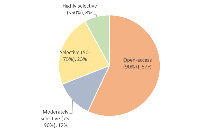
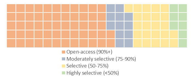
These data are from IPEDS, just a quick count of public college undergraduates by their college’s selectivity.
We can see in both charts the majority enroll in open-access colleges. But the waffle is easier on the eye, I think.
Turns out, the choice between pies and waffles can be contentious.
If you’re like me, you probably want to use a waffle chart to display your data sometime.
You can make one of these in R using the “waffle” command…if you are familiar with that program. I, sheepishly, am not.
For those of us still in the old school, I made this waffle chart in Excel. Please feel free to use in your own work, but keep in mind this will only work for up to four slices of pie.
Download this Excel file: waffle template
Step one: Enter up to four category names in cells B3:B6
Step two: Enter percentages (high to low) in cells C3:C6. The template is just filling these with random numbers as a placeholder.
Step three: Choose which chart you like better, the square waffle or the rectangle waffle. Both charts link to the same data.
Note: You’ll see two other tabs in this file, “chart 1” and “chart 2,” which are the underlying formulas driving the chart. Just pretend they’re not there.
I created and modified this based on a helpful guide found here. If you end up using this file, please let me know if you detect any bugs. I think I’ve worked them out, but don’t hesitate to contact me if you see any or have suggestions.