Tennessee began implementing performance-based funding in 2011 as part of its statewide effort to improve college completions. The figure below uses IPEDS completion data plotting the average number of bachelor’s degrees produced by each of the state’s 9 universities over time.
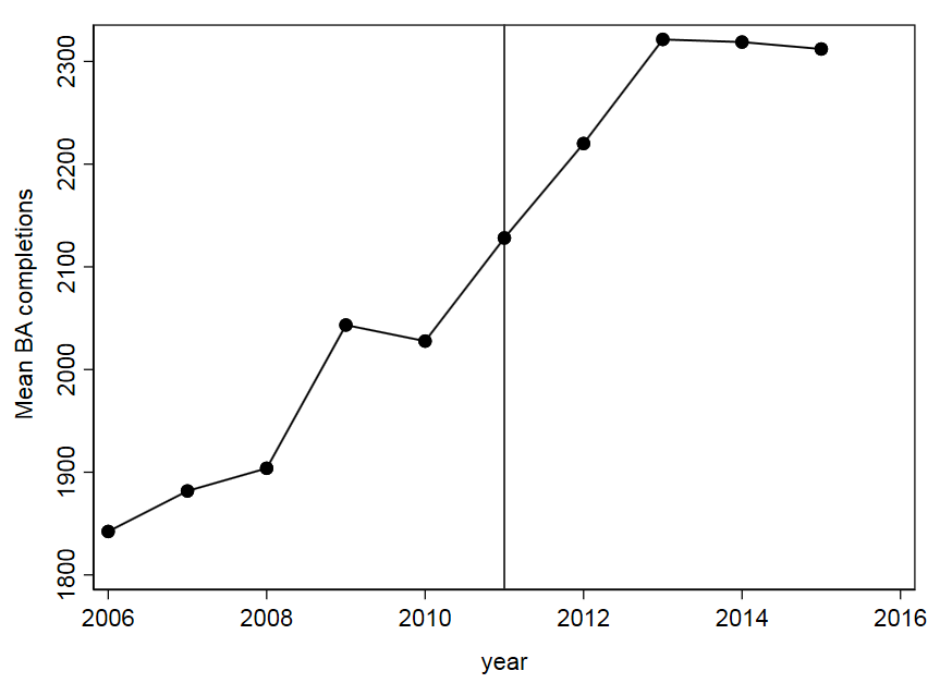
One could evaluate the policy by comparing outcomes in the pre-treatment years against those in the post-treatment years. Doing so would result in a statistically significant “impact,” where 320 more students graduated after the policy was in effect.
| Pre | Post | Difference | |
| Tennessee | 1940 | 2260 | 320 |
This Interrupted Times Series approach was recently used in a report concluding that 380 more students (Table 24) graduated because of the policy. My IPEDS estimate and the one produced by the evaluation firm use different data, but are in the same ballpark.
Anyway, simply showing a slope changed after a certain point in time is not strong enough evidence to make causal claims. In very limited conditions can one make causal claims with this approach. But this is uncommon, making interrupted time series a pretty uncommon technique to see in policy research.
A better approach would add a comparison group (a la Comparative Interrupted Time Series or its extensions). If one were to do that, then they would compare trends in Tennessee to other universities in the U.S. The graph below does that just for illustrative purposes:
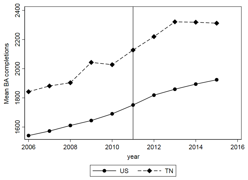
By adding a comparison group, we can see that the gains experienced in Tennessee were pretty much on par with trends occurring elsewhere in the U.S.:
| Pre | Post | Difference | |
| Tennessee | 1940 | 2260 | 320 |
| Other states | 1612 | 1850 | 238 |
| Difference | 328 | 411 | 83 |
The difference-in-differences estimate, which is a more accurate measure of the policy’s impact, is 83. And if we run all this through a regression model, we can see if 83 is a significant difference between these groups.
It is not:
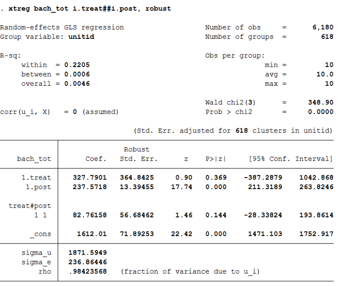
Using this more appropriate design would likely yield smaller impacts than those reported in the recent evaluation. And these small impacts likely wouldn’t be distinguishable from zero.
I wanted to share this brief back of the envelope illustration for two reasons. First, I am working on a project examining Tennessee’s PBF policy and the only “impact” we are seeing is in the community college sector (more certificates). We are not finding the same results in associate’s degree or bachelor’s degree production. Second, it gives me an opportunity to explain why research design matters in policy analysis. I don’t pretend to be a methodologist or economist; I am an applied education researcher trying my best to keep up with social science standards. Hopefully this quick post illustrates why that’s important.