Yearly Archives: 2017

Distribution of PBF funds in Missouri

In anti-tax states like Missouri, it’s a hard political bargain to just give universities new money. Legislators, particularly those on the right, ask “what did colleges do to earn it?” Perhaps the only politically feasible way to get new money for Missouri public higher education is to play the performance funding game. The chart below suggests this may be the case:

mo_shef

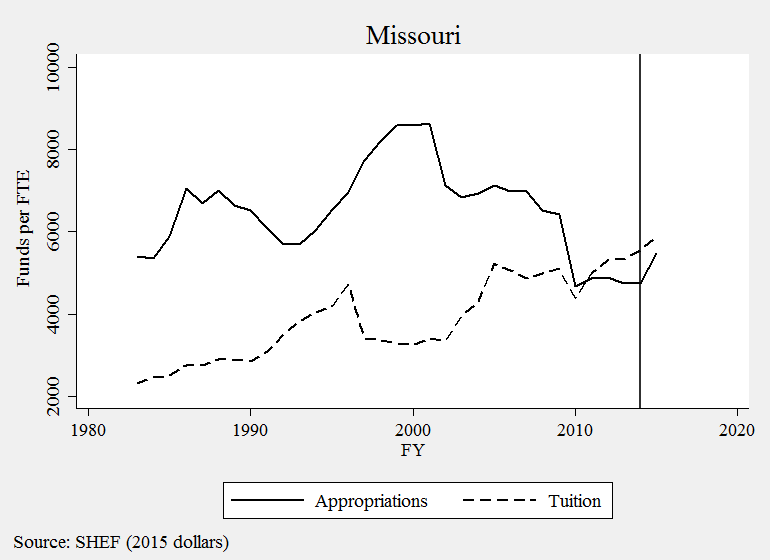
The vertical line is when the state’s new PBF system began. And it is precisely the same year we see the first large uptick in funding since the early 1990s. As it turns out, Missouri operated an old version of PBF from 1993 to 2002, which corresponds with the largest growth period on this 40-year chart.

There are several plausible explanations behind these correlations, but this context helps me think about an alternative goal of performance funding: providing political cover for justifying public investment. I have heard this logic in Wisconsin, which is considering reinvesting $42.5 million in the UW-System. Legislators say they can’t go back to their district and tell constituents, “we just gave universities more money.” Instead, it plays a lot better politically to say, “we reinvested because universities showed us they earned it.” The politics of resentment and the strategic dismantling of public institutions is alive and well in Wisconsin, so performance funding is a convenient political tool for justifying reinvestment.

Tying just a small share of a budget to performance measures may give enough political cover to build a broad coalition of support, even if few funds are actually based on performance. In Missouri, about 3% of funds flow through its performance funding model and advocates would like to see that raised to at least 25%. So let’s look at which Missouri universities benefit from this new era of finance.

A recent audit report provides data we rarely see from PBF states by documenting how much money each institution has received from PBF over time. Since 2014, the state has appropriated a total of $109 million through the model and all four-year universities have received budget increases. We could stop there and say, “everybody’s a winner, so there’s nothing to see here.” But we need to look a bit closer if we’re at all concerned about an equitable funding model for higher education.

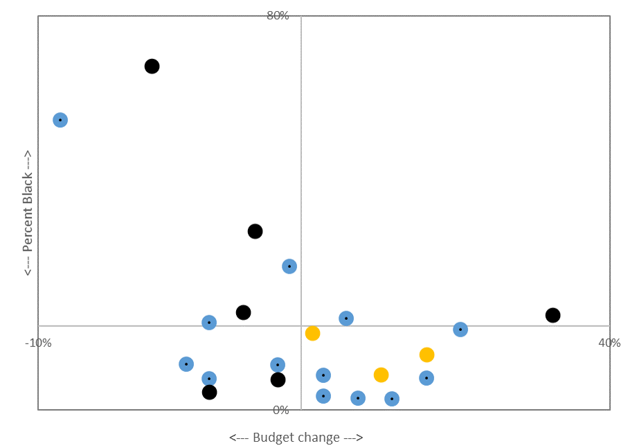
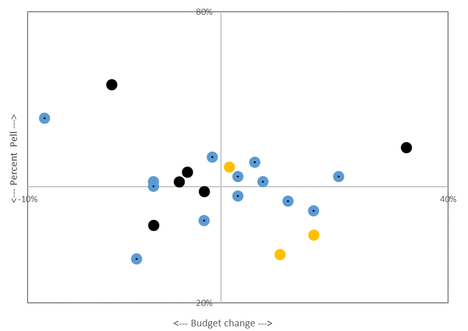
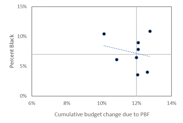
The charts below merge Missouri’s audit data with IPEDS to show overall budgetary gains due to PBF (x-axis)  according to the percent of students receiving Pell and the percent of students who are Black (y-axis).

mo_pell

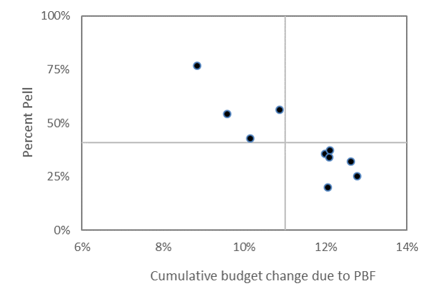
The chart above shows how campuses receiving the largest budgetary gains are those enrolling the smallest share of Pell Grant students. Harris-Stowe State University and Lincoln University, the state’s two public HBCUs, are in the upper-left corner of this chart. They enroll the highest share of Pell Grant recipients, yet they have received the smallest budgetary boost from the new funding model. They did gain money, but not as much as other institutions in the state.

The chart below shifts attention to the share of Black students and finds a similar negative relationship, where colleges enrolling the highest share of Black students tend to have the smallest budgetary growth. Harris-Stowe and Lincoln University are again the two dots in the upper-left quadrant.

mo_black1

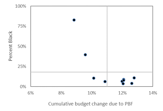
These two campuses enroll about 3% of the state’s total student population, but nearly 20% of the state’s entire Black undergraduate population in the public four-year sector. In a similar back-of-the-envelope analysis, I found nearly identical patterns in Tennessee.

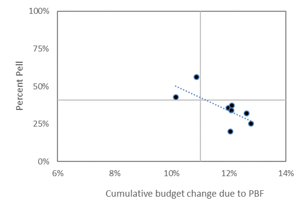
Some might look at these charts and say HBCUs are outliers. If you just removed them from the analysis, then these relationships wouldn’t exist. But that argument misses the entire point and, aside from the dog-whistle politics it evokes, is precisely what we should care most about. Just for the sake of argument, I’ve dropped the “outliers” and replicated the charts below and find the same negative relationship.

mo_pell2mo_black2

There is a lot of work to be done with respect to understanding and explaining the causes of funding inequities in state higher education finance. Even more work is in store if we want to evaluate their consequences and discover new solutions to age-old problems in higher education finance. This will be hard to do when political expedience is the preferred strategy guiding state higher education finance policy. This approach may very well do more to reinforce rather than reverse inequality.

Data:

Total enrollment Budget change from PF Black enrollment Pell enrollment Percent Black Percent Pell
Harris-Stowe 1,280 9% 1,058 981 83% 77%
Lincoln University 2,977 10% 1,179 1,617 40% 54%
Missouri Southern 5,561 11% 341 3,131 6% 56%
Missouri State 18,517 13% 742 5,931 4% 32%
Missouri Western 5,650 10% 590 2,413 10% 43%
Northwest Missouri 5,491 12% 356 1,960 6% 36%
Southeast Missouri 10,848 12% 973 3,698 9% 34%
Truman State 5,910 12% 212 1,187 4% 20%
Central Missouri 9,838 12% 771 3,654 8% 37%
U of Missouri System 51,969 13% 5,659 13,013 11% 25%
  U of Missouri-Columbia 27,642 n/a 2,268 5,756 8% 21%
  U of Missouri-Kansas City 10,453 n/a 1,376 3,285 13% 31%
  U of Missouri-St Louis 13,874 n/a 2,015 3,972 15% 29%

Dealing with FAFSA weeks

There are two ways to track FAFSA completions: week-in-cycle or week-on-calendar. The good folks at the US Department of Education report both, so it’s up to the researcher to decide how best to use this data. Each approach has merits and below are a couple of examples that show why.

The “week-in-cycle” approach seems preferable when states do not have hard filing deadlines. This is because these states use a first-come first-serve approach, where funds are available until they run out. October 1 marked the first day funds were available for the current cycle and January 1 for last cycle. This means “Week 1” is when the state rings the bell to start the financial aid race.

The figure below shows how this plays out in IL and TX. Here we compare last year’s and this year’s cycles and can see nearly identical patterns: there was a nice boost in the first several weeks, but this boost cools down around Weeks 10 or 11. In these states (which have two of the nation’s largest aid programs) we are seeing fewer completed FAFSAs this year:

IL_week_in_cycleTX_week_in_cycle

The “week-on-calendar” approach seems best to use in states that have hard filing deadlines. Missing this deadline means missing out on aid. This matters when comparing trends in the two filing cycles because “Week 13” corresponds with different calendar dates: March 25, 2016, versus December 23, 2017. If I am in a state with a March deadline (as many have) then I want to see how many people have filed relative to that deadline.

California and Tennessee are good examples. California’s deadline is March 2nd and the Tennessee Promise’s deadline is January 17, so let’s set those deadlines at the value of zero below. The weeks on the x-axis tell us how many weeks we are out from the deadline:

CA_deadline_chartTN_deadline_chart

California is still several weeks out from its deadline, but Tennessee is only a few weeks away. In both states, FAFSA completions are below last year’s levels, but we should expect a bump in the weeks immediately prior to the deadline. Once those deadlines pass, we should expect to see things flatten out as the states’ main programs targeted to high school seniors close their books for the year.

The next trick is verifying the priority dates and deadlines for each state. The Office of Federal Student Aid provides a database here and NASFAA has one here, which will be handy as we analyze and share this data.


High school FAFSA filing trends

Every week, the U.S. Department of Education releases data on the number high school seniors who have submitted and completed the FAFSA form. Two UW doc students and I are downloading, archiving, and analyzing this data each week and below is a chart summarizing completions for each state and week of the current cycle (2017-18) and last year’s cycle (2016-17).

Week 13 lattice

Tracking completions by this “week-in-cycle” approach is a first step in monitoring progress and tracking the rhythms of the filing cycle. Notice how there is an early boost in several states, where completions are above last year’s levels. But then notice in most states how that boost seems to flatten out when compared to last year’s cycle.

Nationally, the number completions is down by about 20% from the same time in last year’s cycle. This could simply be because the two FAFSA cycles do not match up on the calendar: Week 13 of the current cycle spans from October 1st to December 23rd, 2016, while Week 13 of last year’s cycle spans from January 1st to March 25th.

For example, California’s deadline is March 2nd and it didn’t change from last year. Week 13 spanned that deadline last year, but not this year. As state filing deadlines pass, we will take a closer look at each one to see whether there is a bump in filing. We are looking closely at Tennessee since the TN Promise deadline is Jan 17 (Feb 15 last year).

Ultimately, we want to know whether earlier and easier filing increases overall FAFSA filing rates. We won’t be able to answer that definitively with our data, but we think we’re taking a step in the right direction.

This is a similar public policy question asked by fellow UW faculty members, who were curious if early voting brings more voters to the polls. This is a complicated question to answer, but they found the short answer was “no” as shown below.

Capture

Surprisingly, early voting may actually depress overall voter turnout. However, when states have election-day registration or couple election-day registration with early voting, they see higher turnout. The authors’ conclusion has stuck with me and is occupying my attention, “election reform has goals other than increasing voter turnout, including minimizing cost and administrative burden…”

We don’t have to squint too hard to see the similarities between these two contexts: making a bureaucratic process easier and earlier does not necessarily increase overall participation. It very well may (and I hope/think it will) with the FAFSA. Drawing lessons from other areas of social science can help us think about higher education in new and creative ways. Doing so might also help us stumble upon new solutions to age-old problems.

If we find that overall filing rates didn’t tick up (or didn’t tick up as much as anticipated) then perhaps we need the equivalent of “election-day registration” for the FAFSA. I don’t even know what that might look like, but it’s something we might need to anticipate if the trends in the chart above don’t pick back up in March when many states’ deadlines are up.

Distribution of OBF funds in Tennessee

The following four charts highlight a critical and often overlooked consequence of Tennessee’s performance-based funding model. The first two are taken from the Tennessee Higher Education Commission’s recent report on the “cumulative change in funding due to the formula.” The left chart includes four-year universities; the right includes community colleges:

TN OBF TN OBF 2

All campuses started at zero in 2010-11 (when the new funding model was first adopted), and by 2016-17 we can see a handful of colleges emerge as winners and losers under the funding model. Austin Peay State University has benefited the most among four-year institutions: APSU funding has increased by 35% since the policy was adopted. In the community college sector, Chattanooga State Community College’s budget has grown by about 27%.

On the other hand, several colleges are hovering right around the 0% line, meaning the formula has not rewarded them with any financial benefits. Tennessee State University, the state’s only public HBCU, stands out as having not received any new money under the formula. This is despite being one of the few campuses experiencing steady enrollment growth during this same period, rising 5% while most other campuses (including APSU) enroll fewer students.

The two charts above include a solid black “total funding” line representing the state average. Four universities are above this line, but these four universities only enroll 6,165 Black undergraduates. The five universities below this line enroll 18,869. In other words, three in four Black undergraduates attend a college receiving the below-average budgetary growth under the state’s model. Exactly the same pattern holds in the chart on the right that looks at community colleges. We could look also look at Pell grant enrollments at these institutions and a similar pattern would persist.

The two charts below look at this in a slightly different way. In these charts, the blue dots are community colleges (n=13), black dots are board of regents universities (n=6), and orange dots are campuses in the UT system (n=3). The horizontal line represents the cumulative budgetary change and vertical lines represent Black and Pell enrollment share.

chart1 chart2

Austin Peay State University is the black dot furthest to the right since it received the greatest budgetary gain. Tennessee State University and Southwest Tennessee Community College are the two left-most dots since they received the greatest budgetary loss. In both charts, we see a negative relationship between budgetary gains and enrolling traditionally under-served students. Less racially and socioeconomically inclusive colleges tend to receive more state support.

These are only back-of-the-envelope calculations using the Tennessee Higher Education Commission report and the most recent IPEDS data. More research is needed to understand the causes and consequences of these trends. But given what we know about college access and student success, and the role state subsidies play to those ends, it seems that Tennessee’s funding model may be poised to reinforce rather than reverse educational inequality.

Raw data:

Budget change Black enroll Pell enroll Total undergrad enrollment % Black % Pell
2010-11 2011-12 2012-13 2013-14 2014-15
1 APSU 4yr 35% 2077 5008 11343 11564 11381 11432 10782 19% 44%
2 Chatt. 2yr 27% 2065 4566 13549 13606 13530 13104 12661 16% 35%
3 Pellissippi 2yr 24% 941 4194 15585 15625 15015 15244 14494 6% 28%
4 UTC 4yr 24% 1255 3520 10106 10941 11197 11265 11232 11% 31%
5 Walters 2yr 21% 171 2550 9093 8744 8390 8010 7601 2% 32%
6 UTK 4yr 20% 1666 6366 23168 22963 22958 23202 23302 7% 27%
7 Roane 2yr 18% 184 2811 8900 8861 8505 8183 7765 2% 34%
8 Dyersburg 2yr 17% 671 1583 4753 4765 4613 4143 3627 19% 38%
9 Columbia 2yr 15% 486 2201 7537 7393 7229 7070 6933 7% 31%
10 Northeast 2yr 15% 206 2697 8785 8468 8427 7676 7556 3% 35%
11 UTM 4yr 14% 1167 3368 9118 8581 8311 7942 7471 16% 42%
12 Nashville 2yr 12% 4181 5021 14305 14329 14688 14573 14396 29% 34%
13 Volunteer 2yr 11% 970 3029 12351 11894 11503 11482 10725 9% 26%
14 ETSU 4yr 11% 812 5119 13752 14194 13960 13455 13196 6% 38%
15 UM 4yr 9% 7203 8057 20299 20650 20443 19939 19850 36% 40%
16 MTSU 4yr 8% 4743 9465 27196 26958 25850 24521 23955 20% 39%
17 Cleveland 2yr 5% 294 1681 4944 4986 4739 4830 4648 6% 35%
18 Jackson 2yr 5% 1169 2026 7412 6752 6172 6180 6616 18% 33%
19 TTU 4yr 5% 409 3640 10352 10940 11005 11252 11331 4% 32%
20 Motlow 2yr 3% 581 1411 6878 6689 6391 6434 6299 9% 22%
21 TSU 4yr 0% 5702 4409 7816 8231 7909 7869 8168 70% 56%
22 Southwest 2yr -8% 9023 6282 19989 19592 17949 16180 15335 59% 39%