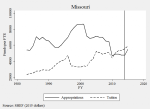
In anti-tax states like Missouri, it’s a hard political bargain to just give universities new money. Legislators, particularly those on the right, ask “what did colleges do to earn it?” Perhaps the only politically feasible way to get new money for Missouri public higher education is to play the performance funding game. The chart below suggests this may be the case:
The vertical line is when the state’s new PBF system began. And it is precisely the same year we see the first large uptick in funding since the early 1990s. As it turns out, Missouri operated an old version of PBF from 1993 to 2002, which corresponds with the largest growth period on this 40-year chart.
There are several plausible explanations behind these correlations, but this context helps me think about an alternative goal of performance funding: providing political cover for justifying public investment. I have heard this logic in Wisconsin, which is considering reinvesting $42.5 million in the UW-System. Legislators say they can’t go back to their district and tell constituents, “we just gave universities more money.” Instead, it plays a lot better politically to say, “we reinvested because universities showed us they earned it.” The politics of resentment and the strategic dismantling of public institutions is alive and well in Wisconsin, so performance funding is a convenient political tool for justifying reinvestment.
Tying just a small share of a budget to performance measures may give enough political cover to build a broad coalition of support, even if few funds are actually based on performance. In Missouri, about 3% of funds flow through its performance funding model and advocates would like to see that raised to at least 25%. So let’s look at which Missouri universities benefit from this new era of finance.
A recent audit report provides data we rarely see from PBF states by documenting how much money each institution has received from PBF over time. Since 2014, the state has appropriated a total of $109 million through the model and all four-year universities have received budget increases. We could stop there and say, “everybody’s a winner, so there’s nothing to see here.” But we need to look a bit closer if we’re at all concerned about an equitable funding model for higher education.
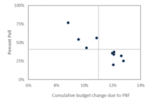
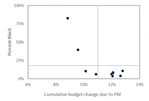
The charts below merge Missouri’s audit data with IPEDS to show overall budgetary gains due to PBF (x-axis) according to the percent of students receiving Pell and the percent of students who are Black (y-axis).
The chart above shows how campuses receiving the largest budgetary gains are those enrolling the smallest share of Pell Grant students. Harris-Stowe State University and Lincoln University, the state’s two public HBCUs, are in the upper-left corner of this chart. They enroll the highest share of Pell Grant recipients, yet they have received the smallest budgetary boost from the new funding model. They did gain money, but not as much as other institutions in the state.
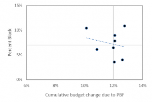
The chart below shifts attention to the share of Black students and finds a similar negative relationship, where colleges enrolling the highest share of Black students tend to have the smallest budgetary growth. Harris-Stowe and Lincoln University are again the two dots in the upper-left quadrant.
These two campuses enroll about 3% of the state’s total student population, but nearly 20% of the state’s entire Black undergraduate population in the public four-year sector. In a similar back-of-the-envelope analysis, I found nearly identical patterns in Tennessee.
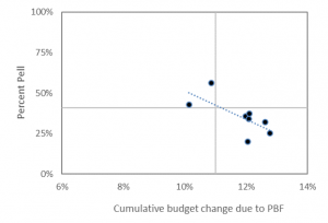
Some might look at these charts and say HBCUs are outliers. If you just removed them from the analysis, then these relationships wouldn’t exist. But that argument misses the entire point and, aside from the dog-whistle politics it evokes, is precisely what we should care most about. Just for the sake of argument, I’ve dropped the “outliers” and replicated the charts below and find the same negative relationship.
There is a lot of work to be done with respect to understanding and explaining the causes of funding inequities in state higher education finance. Even more work is in store if we want to evaluate their consequences and discover new solutions to age-old problems in higher education finance. This will be hard to do when political expedience is the preferred strategy guiding state higher education finance policy. This approach may very well do more to reinforce rather than reverse inequality.
Data:
| Total enrollment | Budget change from PF | Black enrollment | Pell enrollment | Percent Black | Percent Pell | |
| Harris-Stowe | 1,280 | 9% | 1,058 | 981 | 83% | 77% |
| Lincoln University | 2,977 | 10% | 1,179 | 1,617 | 40% | 54% |
| Missouri Southern | 5,561 | 11% | 341 | 3,131 | 6% | 56% |
| Missouri State | 18,517 | 13% | 742 | 5,931 | 4% | 32% |
| Missouri Western | 5,650 | 10% | 590 | 2,413 | 10% | 43% |
| Northwest Missouri | 5,491 | 12% | 356 | 1,960 | 6% | 36% |
| Southeast Missouri | 10,848 | 12% | 973 | 3,698 | 9% | 34% |
| Truman State | 5,910 | 12% | 212 | 1,187 | 4% | 20% |
| Central Missouri | 9,838 | 12% | 771 | 3,654 | 8% | 37% |
| U of Missouri System | 51,969 | 13% | 5,659 | 13,013 | 11% | 25% |
| U of Missouri-Columbia | 27,642 | n/a | 2,268 | 5,756 | 8% | 21% |
| U of Missouri-Kansas City | 10,453 | n/a | 1,376 | 3,285 | 13% | 31% |
| U of Missouri-St Louis | 13,874 | n/a | 2,015 | 3,972 | 15% | 29% |
